

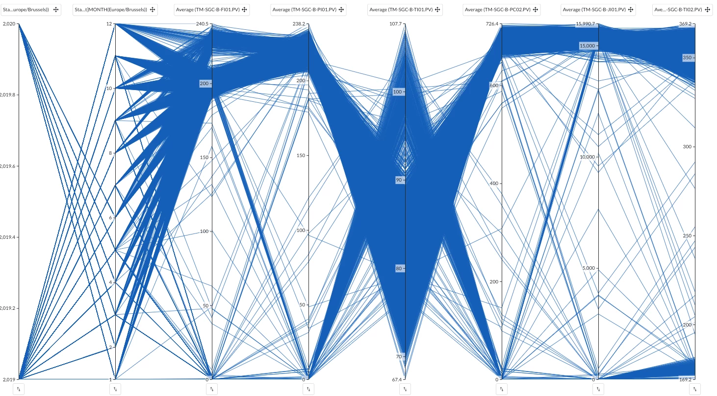
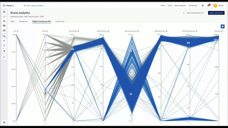
In this article we'll dive into a worklow to create a multivariate parallel coordinates plot that can be filtered by time and calculations. In this specific image, we're looking at the hourly averages of measurements (Power, in and outgoing: flow, temperature, pressure) of a Sales Gas Compressor unit
Workflow
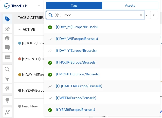
1. Import time-tags as DISCRETE (I'm attaching the .csv file for Europe - Brussels, let us know if you need another timezone in the comments!). This action only needs to be done once. Once imported, the tags will be available for all users.
2. Pick the desired Context period on the bottom of the focus chart in TrendHub
3. Add the relevant tags to your process and the imported [t]HOUR, [t]DAY, [t]MONTH and [t]YEAR tags from step 1.
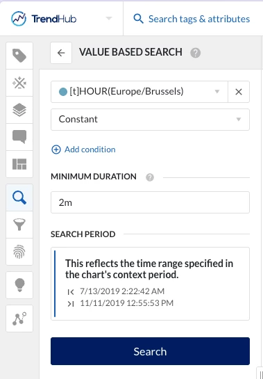
4. Do a Value based search to look for the condition when the hour-tag was constant:
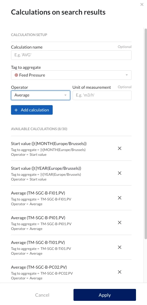
5. Add Calculations that relate to the process you'd like to understand better. Typically, having the average of all other relevant tags should be a good starting point as we have 1 event per hour. (Important! Also include the start value of the HOUR, Month and Year tags)
7. Open Event Analytics - Parallel coordinates plot and play around with the sliders on the Y-axis to see how the hourly events correlate. In the cog wheel menu, you can select which Y-axis should be shown.
In the short video, you can see the parallel coordinates plot being used to first look at only the events happening in 2020, discovering events in March that had a high average Feed Flow and how this correlated to the other added calculations
Pro tip: Use the Histograms tab of event analytics to filter on specific time or calculation values.