











Tips and tricks for using the functionalities to get the best results
Recently active
Gantt charts give morning meetings a clear starting point. Every asset, its operational state, and any events from the last shift are laid out on one timeline, so teams can quickly see what happened overnight, agree on which anomalies are worth digging into, and move into investigation without spending the first 15 minutes piecing the story together from trends.A few practical applications we've seen work well:Instant "did we run?" answer. Green operational bars show uptime coverage at a glance, and any gaps immediately draw the eye. Batch cycle flags. Conditional formatting turns any batch red when cycle time, temperature, or quality exceeds threshold, so the meeting starts with the exceptions rather than the routine. Planned vs. unplanned at a glance. SAP or CMMS maintenance events sit inline with process upsets, removing the "was this us or them?" debate. One-click drill-down. Click any bar to open the context item and jump into TrendHub with tags and timeframe pre-loaded, moving fr
Bridge the gap between identifying issues in your enterprise applications and analyzing the underlying process data, cutting troubleshooting time dramatically.Create a linkage between your external applications and TrendMiner by dynamically creating a URL to either a Dashboard or a TrendView with a pre-populated timestamps and process tags.Following the structure below to create URL Link to a (1) Dashboard or (2) Trend View.Dashboard Embed:https://your_trendminer_url/dashhub/dashboard/123?embed=true&startDate=2025-09-16T14:05:17.590Z&endDate=2025-09-18T14:05:17.590Z TrendHub View:https://your_trendminer_url/hps/index.html#/chart/externalView?start=1709856000000&end=1710374400000&tag=tagname1&tag=tagname2&tag=tagname3
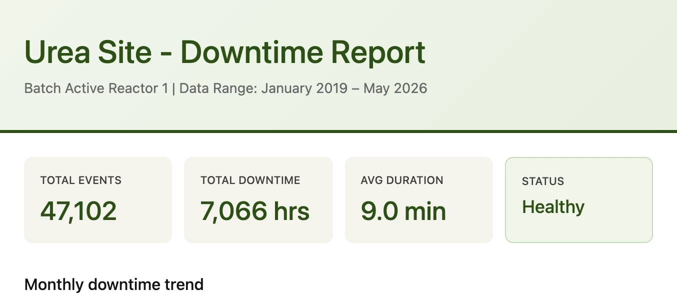
Remember when creating a downtime report meant hours of digging through data, building charts, and wrestling with spreadsheets? Those days are over!By integrating TrendMiner's AI MCP server with your own company’s AI platform (MS Copilot, ChatGPT, Anthropic, etc.) you can now generate comprehensive downtime reports in seconds with just a simple prompt. Behind the scenes, TrendMiner's AI MCP talks directly to your instance while pre-trained skills handle extracting the right data, analyzing patterns, and formatting everything into a professional report.Reach out your CSM or Account Executive if you want to learn more about our AI Early Access Program so you can start leveraging AI with TrendMiner.
Every process engineer has been there. A lab sample comes back out of spec, and now you're working backwards through twelve hours of data trying to figure out what went wrong. The investigation eventually finds something. Maybe a feed shift, a heat exchanger drift, a utility upset. By then the batch is already off-spec and the conversation in the morning meeting is uncomfortable.The goal isn't to investigate faster. It's to see the excursion coming. TrendMiner has the building blocks for predictive analytics in the standard toolkit, no ML Hub required. The workflow below turns one investigation into a soft sensor that runs continuously and warns you before the next excursion lands. Customers like Bayer (a 10% production capacity increase), Kuraray (30 hours of unscheduled downtime prevented) and CP Kelco (potential savings above $1M per year from process deviation reduction) have all turned this kind of analytical work into measurable operational outcomes.The path from excursion to sof
Enhance your TrendMiner dashboards with AI-generated video walkthroughs. Use Copilot-powered Clipchamp to quickly create professional videos that help users understand and get more value from your dashboard data. Step 1: Create a Clipchamp Video in SharePoint Step 2: Generate Your Video with AIWrite a clear description of your video's purpose and provide the script for your audio or on-screen text. Let Copilot AI do the heavy lifting—it will generate a polished, professional video in seconds. Once created, export it as an MP4 file, ready for embedding. Step 3: Embed as an External Content Tile in TrendMinerPreview your video in SharePoint to get the iframe source URL, then embed it as an external content tile in TrendMiner.
This tutorial guides you through pulling time series tag data from TrendMiner into Power BI or Excel using Power Query. It follows the same structure and authentication pattern as the TrendMiner ContextHub article, replacing the context item endpoint with the tag index data endpoint.We will cover the following steps:Finding the Time Series UUID of your tag. Setting up parameters to make the queries dynamic. Writing queries for API interaction. Configuring the output table. Step 1: Find Your Tag's Time Series UUIDThe API identifies tags by a UUID (Universally Unique Identifier), not by the tag name. You need to look this up once per tag. The easiest way is directly from the browser while using TrendMiner.How to Find the UUIDOpen TrendMiner in your browser (Chrome recommended). Open the Developer Tools by pressing F12, or right-click anywhere on the page and choose Inspect. Click the Network tab at the top of the Developer Tools panel. In the TrendHub, search for your tag in the “Search
If you’ve attended one of our VILT TrendMiner trainings, you’ve probably seen a popular workaround: creating a daily aggregation tag that looks discrete (a clean stepwise plot) and updates once per day at midnight. You may have also seen Natasha’s post where she discusses how to build the stepped daily tag.This is a simple but powerful technique when you want a tag that reports something like: Daily average Daily total Daily max/min Daily standard deviation Any other 24-hour aggregation you want to visualize as a “daily value” In training, we typically build this so the tag updates at midnight. But recently a user asked a great follow-up: can we build a similar tag that steps at a certain hour of the day instead of midnight?Good news! You can do this with a small modification to the same workaround. In this post, I’ll walk through this modified approach that lets you step your daily aggregation at the hour to your liking. Step the daily aggregation at 7:00 AM (or any hour)In th
Collaboration is at the heart of successful industrial analytics. Over the past year, TrendMiner has transformed how teams share and manage their work, evolving from simple read-only sharing to a comprehensive collaboration suite. This article walks you through these improvements and shows you how to leverage them for more effective teamwork. The Journey: From Simple to Sophisticated Before 2025.R2: Read-Only SharingInitially, TrendMiner allowed users to share individual work items with read-only access. While this enabled knowledge sharing, it had limitations: recipients could view analyses but couldn't contribute or modify them, making true collaboration difficult for teams working across shifts or locations.2025.R2: Write PermissionsThe August 2025 release marked a significant milestone by introducing Write Permissions. Users could now grant colleagues write access to work items, enabling multiple team members to actively collaborate on the same analysis. This was particularly valu
This Functional Tips & Tricks post was inspired by a Community question from Yves - the question can be found here. Creating a Time Proxy Tag with Custom Calculations In TrendMiner, scatter plots and regression tools require numeric X- and Y-axes. While most process tags (temperature, pressure, flow, etc.) are already numeric, time itself is not. This creates a challenge when you want to perform a linear regression of a tag versus time.To solve this, we create a time proxy tag: a numeric tag that increases as time progresses over a defined window. Once this tag exists, it can be used on the X-axis of a scatter plot against any process tag on the Y-axis, enabling linear regression and trend analysis. Why a Time Tag Is Required TrendMiner’s scatter plots do not allow timestamps directly on the X-axis. Instead, both axes must be numeric tags. Therefore, to analyze temperature vs time, we must first convert time into a numeric variable.This numeric time tag: increments as time advances
TrendMiner’s new webhook implementation allows users to alert an external system such as SAP, Microsoft Teams and potentially other platforms when certain events happen (i.e. when a TrendMiner monitor is triggered).Beyond sending custom messages, webhooks can also initiate automated workflows or processes in external systems, such as creating work orders, submitting maintenance requests, or triggering other actions.The example below shows how a TrendMiner monitor can detect the start of a new batch and automatically post notifications to a Microsoft Teams group, both at batch start and upon batch completion.If you are interested in learning more and are interested in this new webhook integration available in 2025.R3 or newer, reach out to your CSM and/or Account Manager.Step 1: Define a Context Item Type (for example, Epoxy Resin Batch). Step 2: Create & save a value-based search that reliably detects when a batch starts and ends.Step 3: Configure a TrendMiner Monitor to automatica
When you add a link in the DashHub text tile, by default it will open up in a new tab. If we were to look into the actual html content that is saved in the tile when we create a link via the editor, it will look something like this:<p><a href="https://cs.trendminer.net/dashhub/#/dashboard/599f8acf-690e-4034-8811-d596ac826d25?mode=presentation" target="_blank">test</a></p>This represents a link with the text 'test', which links to another dashboard. The target="_blank" means it will open up in a new tab.If we want the link to open up in the same tab, this target would need to be replaced "_self", or be left out entirely. Unfortunately, the text tile editor does not allow us choose the target, or edit the html directly.A trick I learned from a user recently though, is that a URL copied from certain other places, will have the target omitted, thus opening in the same tab. This is true for browser bookmark links, for example. A quick workaround I now use to have a l
Design conditions often look great on paper but once a process is running in real life, the true optimal conditions can be very different. This gap makes it harder to understand the process and to make confident, data-driven decisions based on controlled variables.To truly understand a process—and improve it—we need to analyse data under normal operating conditions.Whether you’re working with:an active batch (batch process), or a running system (continuous process),you can start by searching the relevant operating periods and then adding calculations on top of that search. By selecting the operator average for each tag, we establish a strong baseline: the most common, real-world values of our variables. 💡 This is where Event Analytics shines.With event analytics, you can:Visualise distributions of operating conditions across variables in parallel (parallel coordinate plots) Quickly identify patterns and typical behaviour Apply refinements to remove outliers or exclude conditions that
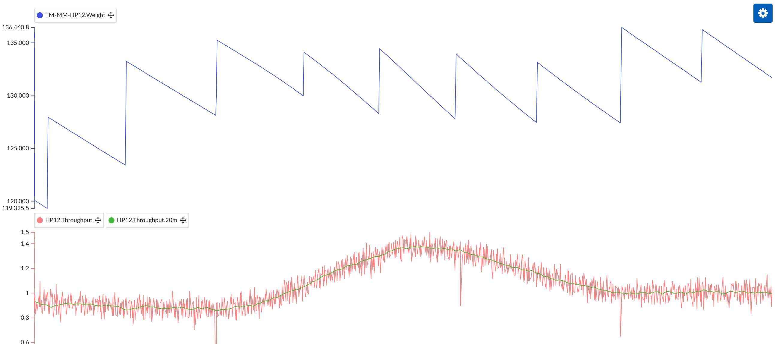
It can occur that we wish to know the flowrate of a certain material stream, but that the only measurement we have available is the weight or level of an intermediary vessel. This is especially applicable to the processing of solids, where measuring a flow directly is challenging. In this example, let's then work with the concept of deriving a mass flow from a total weight.In essence, the mass flow is nothing more that then change (delta) of the weight of our vessel, multiplied by a constant value (to obtain the result in the desired units). As a starting point, we could for example take the weight in kg of our vessel 5 minutes ago, subtract the current weight, divided the result by 300 (the number of seconds in 5 minutes), to obtain a mass flow in kg/s:Note that the choice of the interval duration (here 5m) should depend on how noisy our weight measurement is. The longer we take the interval, the smoother our flow tag will become, at the cost of increasing the lag with which changes i
If you are using TrendMiner APIs to access context items (for example to pull them into PowerBI), it makes sense to set up a client user for this purpose. In fact, it is recommended to use a distinct client for every TrendMiner automation you set up. These clients can be configured by a system administrator in ConfigHub. After setting up authentication via your new client id + secret, you may notice that you cannot access some context items. This is because they are attached to assets to which the client does not have any access rights. These asset permissions can be granted by an application administrator in ContextHub. There is an issue, however: the user search UI does not retrieve client users, and so there seems to be no way to grant permissions to our client user. Thankfully, such a limitation does not exist in the back end. Through a series of API calls, we can configure our client to have the required permissions. In this example I use the built-in API console (accessible by a
We’re excited to announce that one of the most requested dashboard features is finally here: Gauge Tiles are now available in TrendMiner’s 2025.R3 release.Gauge tiles provide a simple, intuitive way to monitor KPIs and process values at a glance. Whether you're tracking a critical parameter in your unit or creating a clean, executive-level overview, gauge tiles make it easier to visualize where your values stand. Gauge tile display modes:Gauge tiles come with four built-in display styles to fit different dashboard layouts and preferences: Angular Speedometer Linear Horizontal Linear Vertical You’ll see all four showcased in the screenshot included below. Dashboard with angular (conc and temp), speedometer (flow), linear horizontal (coating), and linear vertical (level) gauge tiles.Configuration and setup:To configure a gauge tile, the only required inputs are the minimum and maximum values. From there, you can tailor it to your needs with several optional settings: Target value
Scatter Plots have long been one of TrendMiner’s most powerful tools to visualize relationships between process parameters. In recent releases, this functionality has been significantly enhanced — making it easier than ever to uncover correlations, compare time periods, and analyze performance in detail.Let’s take a closer look at what’s new and how you can apply these features in practice using a heat exchanger example. 1. From Trends to Scatter PlotsWhen analyzing process data in TrendHub, you can easily switch the visualization type under “Select chart type” — directly below the focus chart. From there, you can change the default Stacked trend view to Trend or Scatter.In the Multi scatter view, all visible tags from your active tag list are plotted against each other. Each combination generates a scatter plot, accompanied by histograms and a regression line (initially linear), including its regression coefficient.This multi-dimensional view is ideal for identifying correlations be
Daily production tracking isn't just a routine: it's the backbone of efficiency, quality, and transparency in manufacturing. But are you making the most of TrendMiner’s powerful features? Whether you are a TrendMiner veteran or just starting out, a few small habits can make a big difference in how you track performance and communicate across shifts. Start Your Day with a Clear ViewImagine starting your workday or shift with a dashboard that shows you exactly what you need: no more hunting for numbers or flipping between screens. TrendMiner dashboards let you visualize your most important metrics (throughput, yield, downtime, quality, and more) at a glance.Use tiles to compare production in the last few days, monitor targets vs. actuals, and spot trends before they become issues. Set up a dashboard tailored to your role —operator, engineer, or manager— and see how much time you save each day! Ensure a Smooth Shift HandoverEver come in for your shift and wonder, „What happened last nigh
Have you ever struggled to find the right tag while using TrendMiner?When the historian’s tag names are full of digits and cryptic codes, it can be tough to know which sensor or process you’re actually looking at. That confusion can slow down your analysis and make it harder to trust your findings. That’s where the Digital Twin Manager comes in. 🧠 With this tool, application administrators can build an asset framework — a clear, folder-like structure that organises every piece of process equipment in a logical, user-friendly way.Here’s how it helps: 🗂️ Organise your assets by creating nodes (folders) for each equipment. 🏷️ Add and rename tags to use meaningful names and descriptions. 🔍 Simplify searches — instead of typing complex codes, just browse the framework to find what you need. Asset Framework of a Combined Cycle No more confusion. No more wasted time figuring out which sensor is which.Just faster insights and smarter decisions. Digital Twin Manager = Time saved + Produ
Did you know you could add certain content from outside of TrendMiner to your dashboards? The external content tile allows you to add additional information to your dashboards that doesn’t necessary originate from your process data. Many often include training videos, images, and Visio block flow diagrams, stored on SharePoint pages, to give better context to those interpreting dashboards shared across teams or shown on control room displays.@EdwardB recently shared some interesting sources that allow embedding weather related widgets to DashHub. For this, you can try these twosources: https://widget.airnow.gov/ and https://embed.windy.com/Do you have other interesting applications you’d like to share with the community? Comment below!
In this article we'll dive into a worklow to create a multivariate parallel coordinates plot that can be filtered by time and calculations. In this specific image, we're looking at the hourly averages of measurements (Power, in and outgoing: flow, temperature, pressure) of a Sales Gas Compressor unit Workflow 1. Import time-tags as DISCRETE (I'm attaching the .csv file for Europe - Brussels, let us know if you need another timezone in the comments!). This action only needs to be done once. Once imported, the tags will be available for all users. 2. Pick the desired Context period on the bottom of the focus chart in TrendHub 3. Add the relevant tags to your process and the imported [t]HOUR, [t]DAY, [t]MONTH and [t]YEAR tags from step 1. 4. Do a Value based search to look for the condition when the hour-tag was constant: 5. Add Calculations that relate to the process you'd like to understand better. Typically, having the average of all other relevant tags should be a good starting point
BackgroundTrendMiner provides a set of Time/Date Tags by default with installation. These tags deliver time and date information directly from the system – independent of any process data – and are available for all time zones: TM_hour_* – Hour of the day TM_day-* – Day of the month TM_month_* – Month TM_year_* – Year Time/Date Tags in TrendMinerTime/Date Tags for all time zones in TrendMinerThey allow for precise configuration of searches, calculations, or monitors tied to specific moments or recurring time patterns – think daily reports at a fixed time or tracking values at the beginning of each month.For full details, see the User Guide. 🎓 Deep Dive & Training ResourceWant to go further? Check out these advanced trainings for practical, hands-on examples: Mastering Tag Types in TrendMiner – Tips, Tricks & Hands-On Exercises (Exercise 3) Event Analytics in Action: Gain Deeper Process Insights (Exercise 2) 🌟 Community Inspiration – Related PostsHere are great examp
❓What Are Custom Calculations?Custom Calculations in TrendMiner empower advanced users to define new tags using Python scripts, enabling analytics and data transformations beyond what’s available through standard formulas or aggregations. This feature is powerful for creating custom KPIs or logic that’s specific to your plant or workflow. 🗂️ Repo Structure OverviewThe TrendMinerCS/custom-calculations repo is your go-to resource for getting started with Custom Calculations. It includes: A Jupyter notebook with a detailed explanation of the workings of custom calculations and the TrendMiner sdk. A detailed README outlining the possibilities with examples and screenshot. Example Python scripts for common calculation scenarios. Templates to help you quickly build your own scripts. Clearly organized folders so you can browse by use-case or script type. Browsing this repo is the fastest way to kickstart your own Custom Calculations and learn best practices directly from TrendMiner a
Have you ever had a situation were you would like to see how your measurement is doing and how close is it of its allowed Upper and Lower limits? Have you ever tried to create a dashboard where you can easily see the status of your equipment and in which zone is it performing?Up until now, in TrendMiner we could create a monitor that tells/notify us whenever a limit is surpassed or reached. Additionally, in a dashboard we could create a monitor tile that will change when this monitor has been triggered. But this only allows 2 status: On/Off, Good/Bad, etc. If we want to have more statuses, we were already limited by the use of only one tile. Monitor tile configured with 2 states. An easy workaround is usually to create a traffic light system, where monitor tiles are used for each different status. For example, in a tank level, in order to have Low, Intermediate and High level, we would need 3 monitor tiles as shown in the picture. Traffic light system with 3 states for a tank level. H
Background:In many use cases, it’s not just the type of event that matters — its duration can be just as important. While TrendMiner allows you to define a minimum duration when performing a search, sometimes you want to look only for events that fall within a specific time window, for example between 2 and 5 hours.Here's how to do that using two simple approaches. ✅ Option A: Refine Search Results by Duration RangeUse this approach to narrow down results after you’ve run your main search.Steps: Run your event search based on the relevant value or digital criteria. In the search panel, click "Event Analytics". Set the minimum duration to 2 hours and the maximum duration to 5 hours. Your results list will now only show events that occurred within this defined time frame. 🔍 Tip: Perfect for quickly filtering without modifying your original search setup. Search for events with a duration of 2 hours to 5 hours 🚫 Option B: Exclude Longer Events Using a Static FilterThis method help
Ever wanted to include data from external sources in your TrendMiner analysis?The Tag Builder Data Import functionality allows you to do just that! This post will equip you with some helpful tips and tricks to ensure a smooth data import experience.Getting StartedSupported File Format: Only CSV (comma-separated values) files are supported for data import. Make sure your data is formatted correctly before proceeding. File Requirements: File Extension: Ensure your file has the proper .csv extension. Encoding: Use UTF-8 encoding for your CSV file. File Size: The maximum file size supported is 45 MB. Data FormattingFirst Row: List the tag names you want to appear in TrendMiner in this row (Column 2 onwards). These names must be unique. Second Row: Descriptions for each tag can be added in this row, but are optional (Column 2 onwards). Third Row: Specify the units of measurement for each tag in this row, but are optional (Column 2 onwards). Fourth Row: Define the tag type (analog, discret
Already have an account? Login
No account yet? Create an account
Enter your E-mail address. We'll send you an e-mail with instructions to reset your password.