

In this post, we will cover how to create a KPI tag using tag aggregation and how to track the KPI in real time within a TrendMiner dashboard. This example begins in TrendHub, where we create the aggregation tags, and then transitions to DashHub, where we use the current value tile to display the KPI in real time.
Creating KPI Aggregation Tags in TrendHub
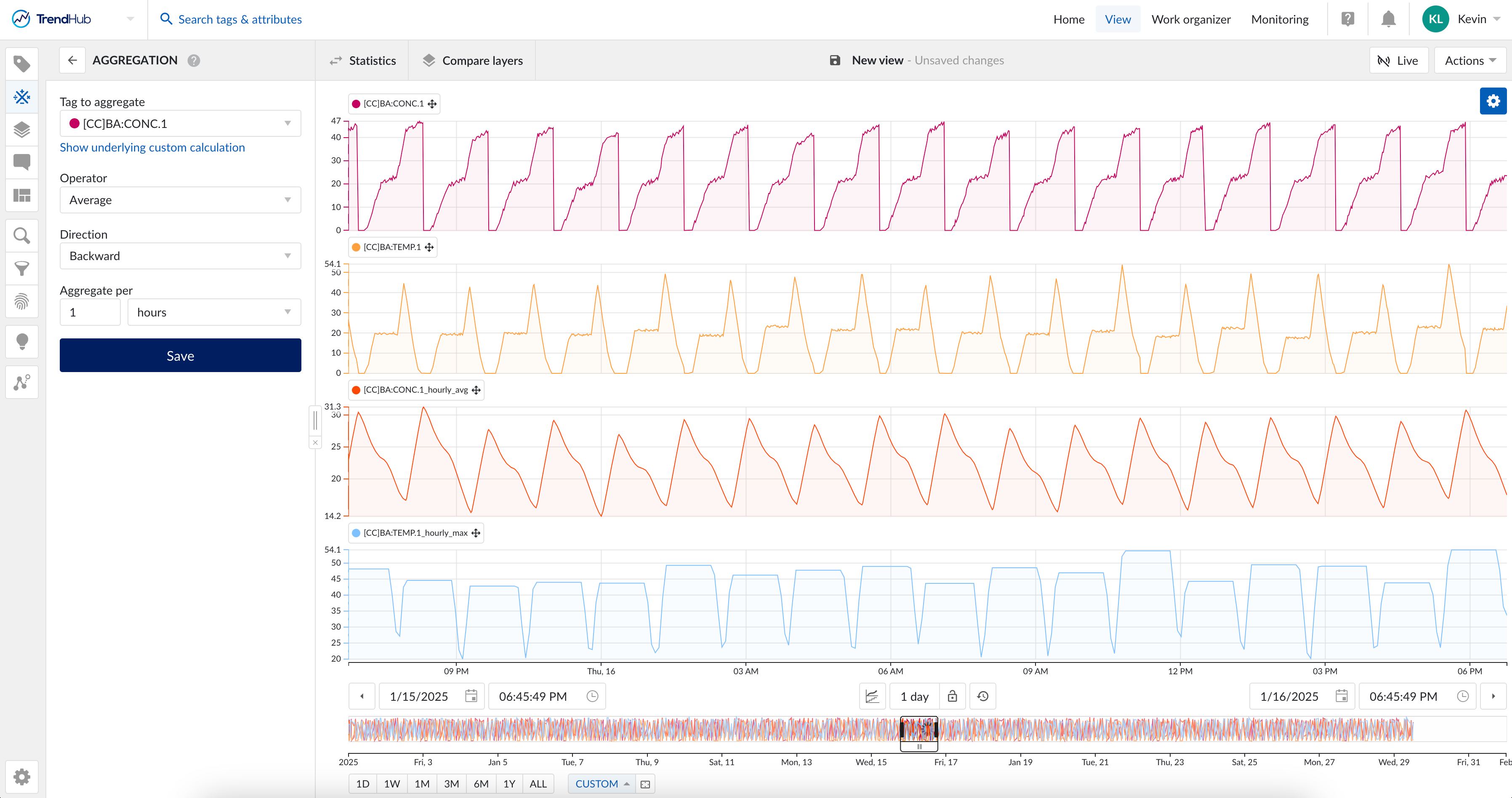
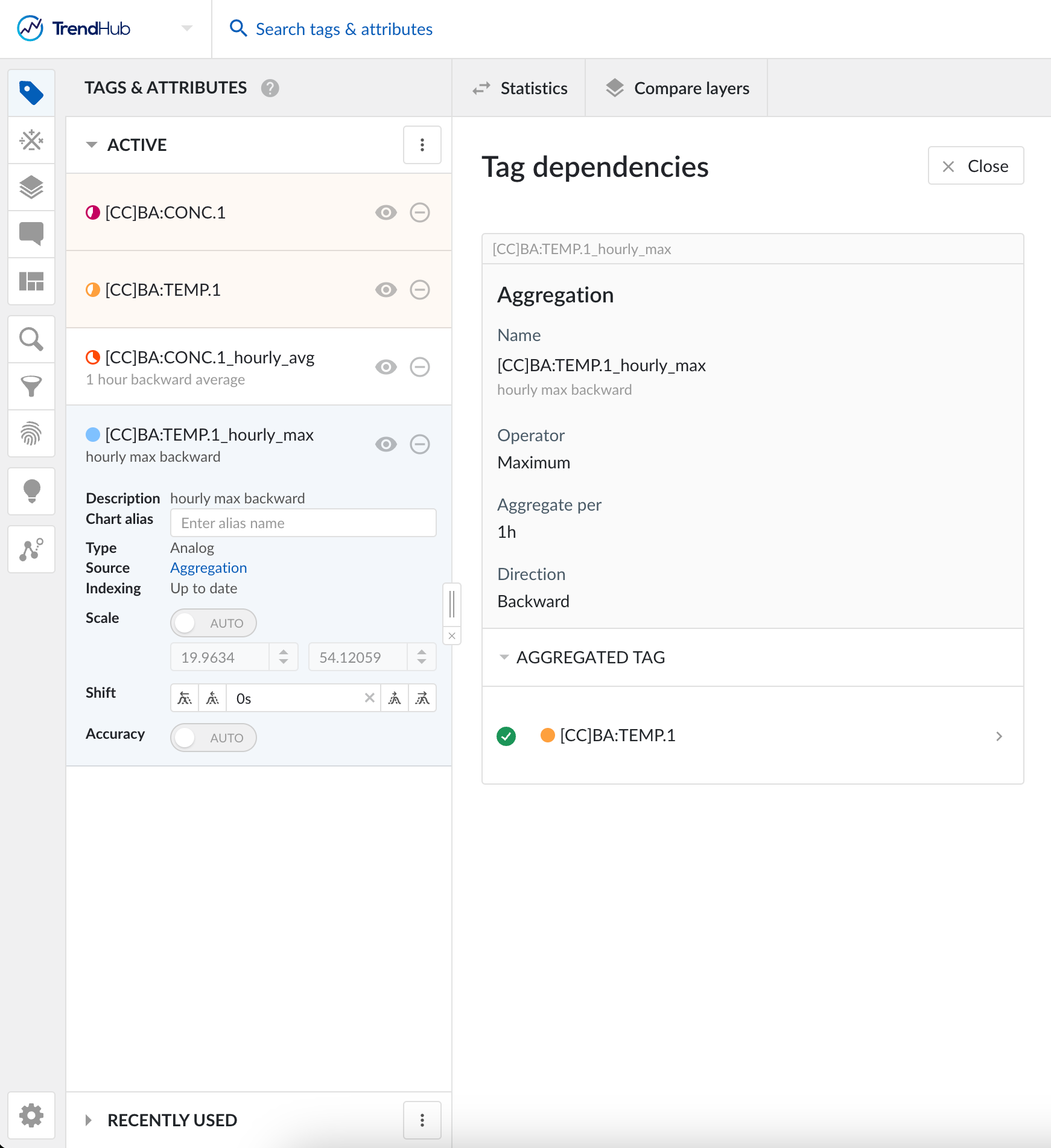
In TrendHub, we can create an aggregation tag from process tags. For example, if we want to calculate the 1-hour average of concentration, we can aggregate the concentration tag and select the average operator. This will be the first KPI to track. The second KPI is the maximum temperature from the past hour. Instead of the average operator, we need to select the maximum operator and apply it to the temperature tag. The screenshots below illustrate the parameter selection for creating these two aggregation tags in TrendHub.
Displaying KPIs in DashHub
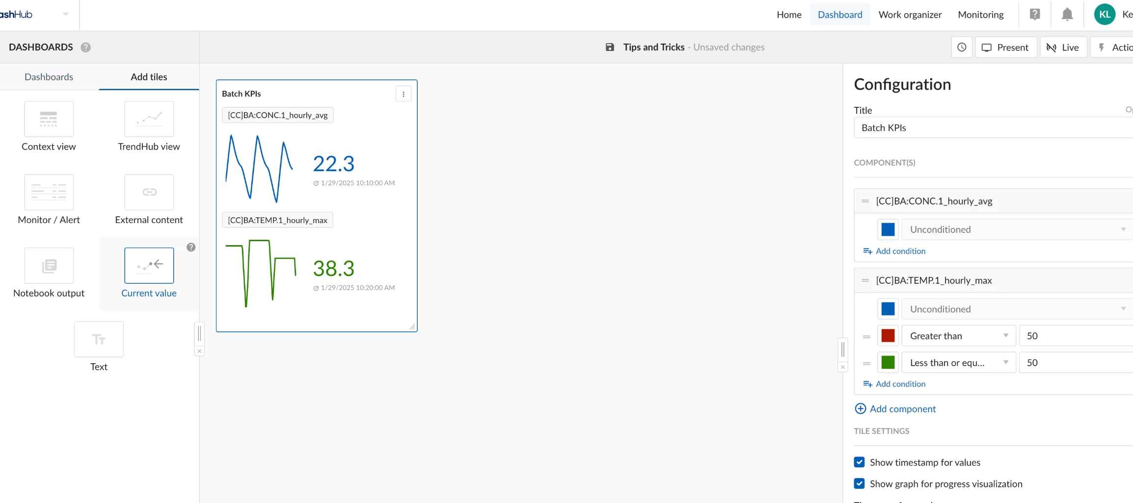
Once we have saved and named these new tags, we can switch to DashHub and add the current value tile to our dashboard. When adding the tile, we need to select the component/tag(s) to display. Here, we will add the two aggregation tags we just created.
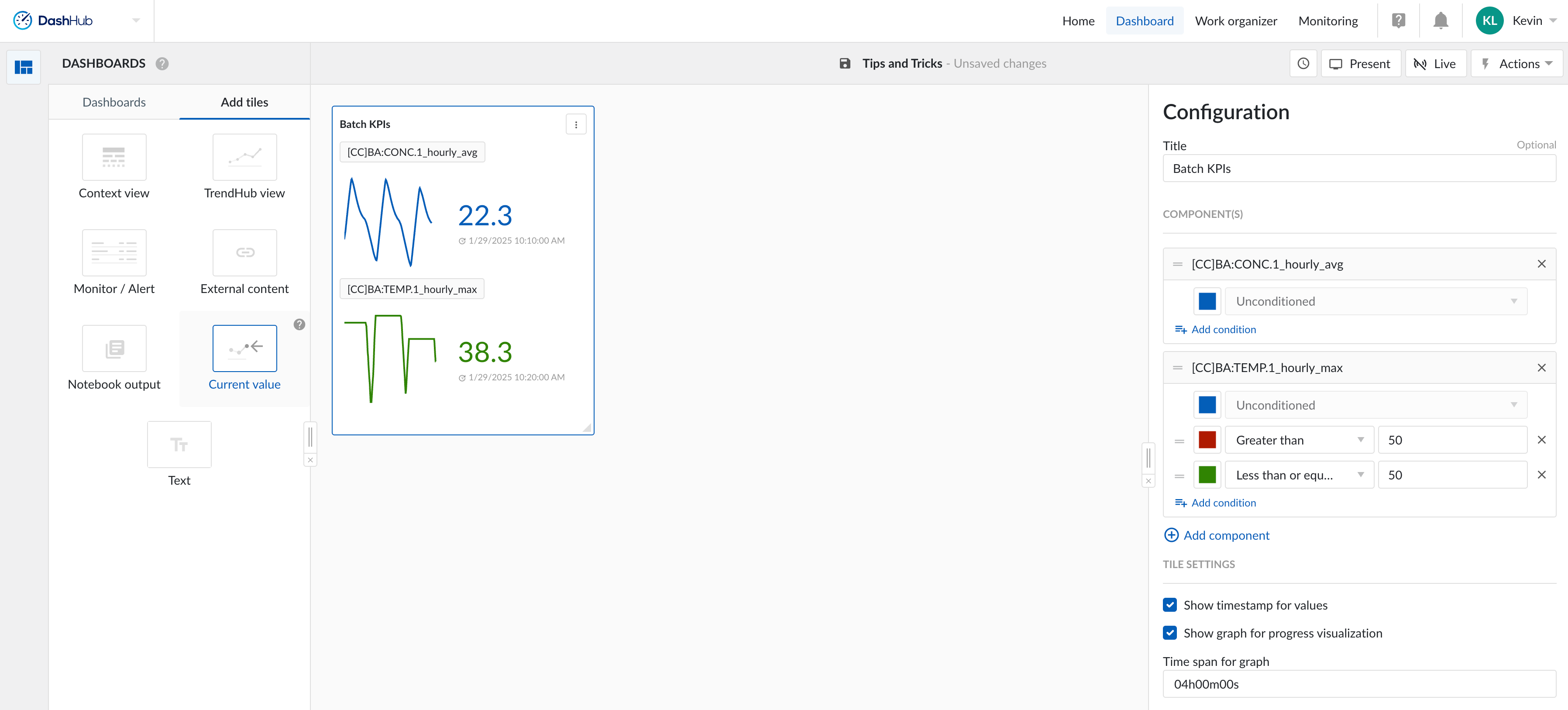
We can also apply color formatting based on predefined rules. For example, I will set a rule for the temperature tag: if the value is above 50, it will be displayed in red; if it is below 50, it will be displayed in green. This is a key safety metric, which is why color conditioning is important.
Other display options for the current value tile include "Show timestamp for value" and "Show graph for progress visualization." You can toggle these settings based on your preferences.