
Scatter Plots have long been one of TrendMiner’s most powerful tools to visualize relationships between process parameters. In recent releases, this functionality has been significantly enhanced — making it easier than ever to uncover correlations, compare time periods, and analyze performance in detail.
Let’s take a closer look at what’s new and how you can apply these features in practice using a heat exchanger example.
1. From Trends to Scatter Plots
When analyzing process data in TrendHub, you can easily switch the visualization type under “Select chart type” — directly below the focus chart. From there, you can change the default Stacked trend view to Trend or Scatter.
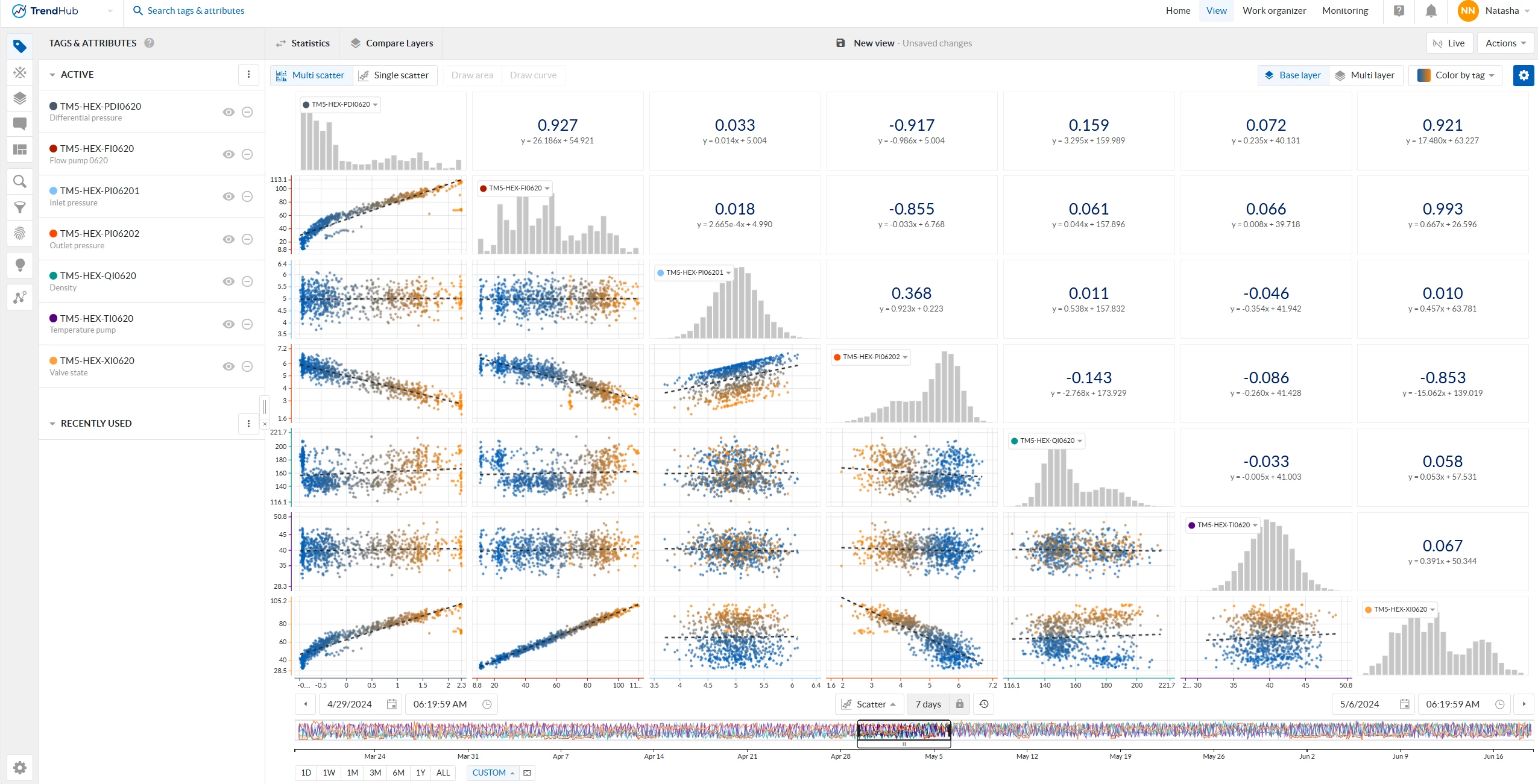
In the Multi scatter view, all visible tags from your active tag list are plotted against each other. Each combination generates a scatter plot, accompanied by histograms and a regression line (initially linear), including its regression coefficient.
This multi-dimensional view is ideal for identifying correlations between process variables such as differential pressure, pump flow, inlet and outlet pressure, density, temperature, and valve state — key indicators in our heat exchanger example.
📈 Example:
In a heat exchanger setup, scatter plots help visualize how different process variables relate to each other. This makes it easy to spot trends, correlations, or unexpected behaviors that might not be visible in a time-based trend view.
2. 2024.R2 — Scatter Plot Formatting by Layer
The 2024.R2 release introduced scatter plot formatting by layer, reducing the need to export chart data for further visual analysis. You can now differentiate between periods of operation directly in your scatter plots — for example, before and after maintenance, or during different operating modes.
Each layer can be assigned its own color, helping you:
-
Identify shifts in KPIs and operating parameters
-
Detect changes in correlations across time periods
-
Speed up root cause analysis
👉 Learn more in this related post:
How to use the new Multi-layer scatterplot
and this practical example:
Comparing performance before and after maintenance using multi-layer scatter plots
3. 2025.R2 — Higher Resolution & Advanced Regression Models
With 2025.R2, single scatter plots received a major upgrade:
-
Increased data resolution – single scatter plots can now display up to 200,000 data points, depending on the selected time range — compared to just 1,000 in previous versions. Note: In multi-grid view, the limit remains 1,000 points.
-
Expanded regression options – in addition to linear regression, you can now apply logarithmic, polynomial, power, and exponential regression models to better fit your data. Example: When plotting pump flow (y-axis) against differential pressure (x-axis), a polynomial or power regression often provides a more accurate representation of the pump characteristic curve than a simple linear fit.
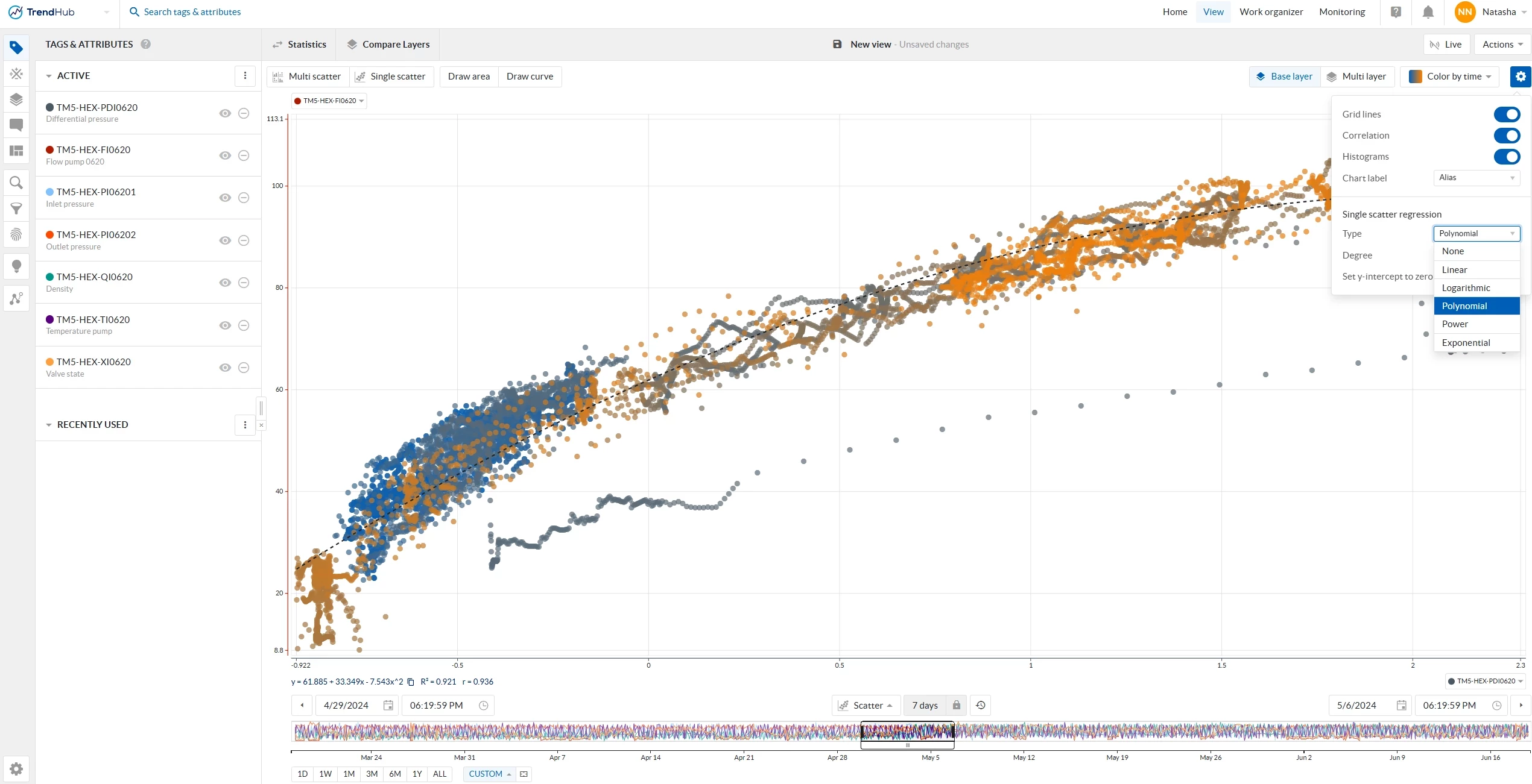
Pump flow plotted against differential pressure with polynomial regression line -
Reference lines – you can now overlay up to five reference lines (or curves) on your scatter plot.
These can be drawn manually or defined using mathematical formulas. This is especially useful when comparing current equipment behavior against:-
A pump performance curve (manufacturer model)
-
A thermal efficiency model of a heat exchanger
-
A historical best-performance curve derived from optimal operating periods
-
4. 2025.R3 — Color by Tag
The latest release (2025.R3) adds a powerful visualization enhancement:
You can now color your scatter plot by a third tag in single-layer mode.
Coloring Options
-
Gradient coloring: Continuous scale based on the tag’s value range (similar to the color-by-time gradient).
-
Condition-based coloring: Define numerical conditions (e.g. value > 75) for distinct color categories — perfect for highlighting thresholds or performance limits.
-
Markers: Assign unique markers for each condition to improve clarity when multiple categories are present.
Digital/String Tags
You can select up to 10 states, each with its own color and marker — ideal for categorical data such as equipment states or batch identifiers.
🎨 Example:
In the heat exchanger case, color your data points by valve state to see how flow and pressure relationships vary between open, partially open, and closed valve conditions. This instantly reveals operational zones and potential control issues.

5. Combining Scatter Plots with Operating Area Search
Scatter plots pair perfectly with Operating Area Search, allowing you to define and compare normal and abnormal operating conditions visually.
If you haven’t explored this yet, check out:
Using the least used features to your advantage – Operating Area Search
6. Want to Learn More?
You can find more details and release notes in the TrendMiner User Guide and Documentation Portal:
-
Documentation Portal
Both sites allow you to select your TrendMiner version (top left corner) to make sure you’re viewing the correct documentation for your release.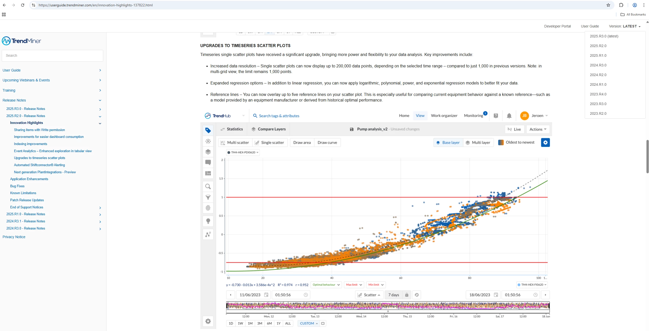
2025.R2 release notes highlights of the latest TrendMiner version in the user guide
Tip 💡
For best results, start simple:
Pick two correlated process tags, visualize them in a scatter plot, then add additional layers or color dimensions step by step. You’ll be surprised how quickly patterns emerge that remain hidden in time-based trends.
We’d love to hear about your experiences!
Share your own scatter plot discoveries, examples, or best practices with the community — either by commenting below or creating your own post in the TrendMiner Community 🙂