
We’re excited to announce that one of the most requested dashboard features is finally here: Gauge Tiles are now available in TrendMiner’s 2025.R3 release.
Gauge tiles provide a simple, intuitive way to monitor KPIs and process values at a glance. Whether you're tracking a critical parameter in your unit or creating a clean, executive-level overview, gauge tiles make it easier to visualize where your values stand.
Gauge tile display modes:
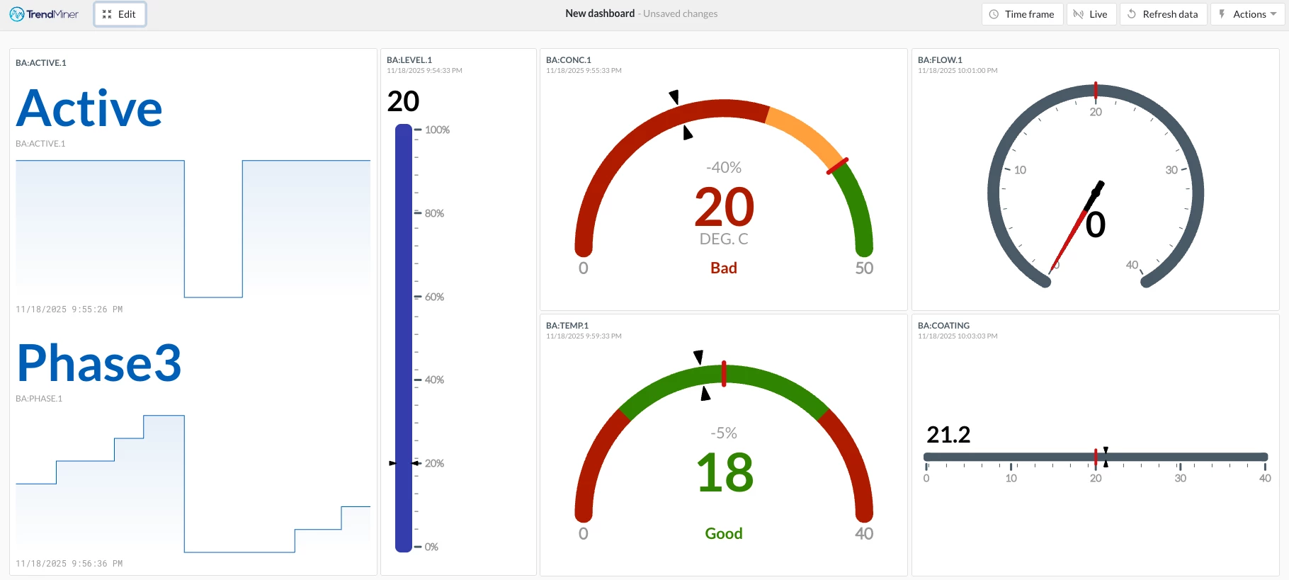
Gauge tiles come with four built-in display styles to fit different dashboard layouts and preferences:
-
Angular
-
Speedometer
-
Linear Horizontal
-
Linear Vertical
You’ll see all four showcased in the screenshot included below.
Configuration and setup:
To configure a gauge tile, the only required inputs are the minimum and maximum values. From there, you can tailor it to your needs with several optional settings:
-
Target value
-
Color-coded ranges (based on static values)
-
Tile title
-
Timestamp display
-
Use chart alias
-
Target difference (absolute or percentage)
-
…and more
These options were designed to provide flexibility while keeping the setup straightforward.
Enhance your dashboards:
We are excited for the immediate impact gauge tiles will have for TrendMiner users! Gauge tiles pair well with the Statistics Tile via TrendHub View (also a new feature!), making dashboards more informative and visually clear - ideal for reporting and monitoring use cases.
We can’t wait to see how you use the new gauge tiles in your workflows. Please let us know how you like it. As always, we welcome your feedback and any suggestions to improve the gauge tile.