
In our latest release, 2024R2, we’ve enhanced the Scatterplot display in TrendHub to visualize all layers of a TrendHub view, not just the base layer. This new feature enables you to compare relationships between different tags across multiple layers, making it a powerful tool for troubleshooting, root cause analysis, performance grading, and more. In this article, we'll walk you through how to use this new feature to its full potential.
Step 1: Adding Different Layers
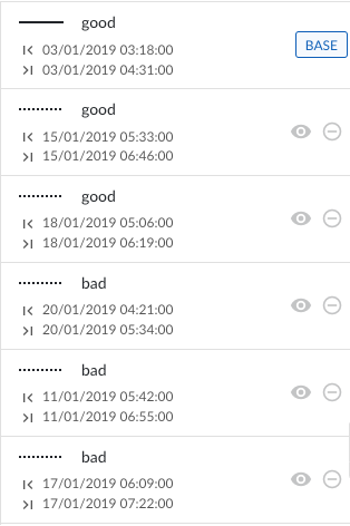
There are several ways to add layers in TrendMiner. In our example, we used value-based searches to identify high- and low-quality batches and added the three highest quality and three lowest quality batches as layers.
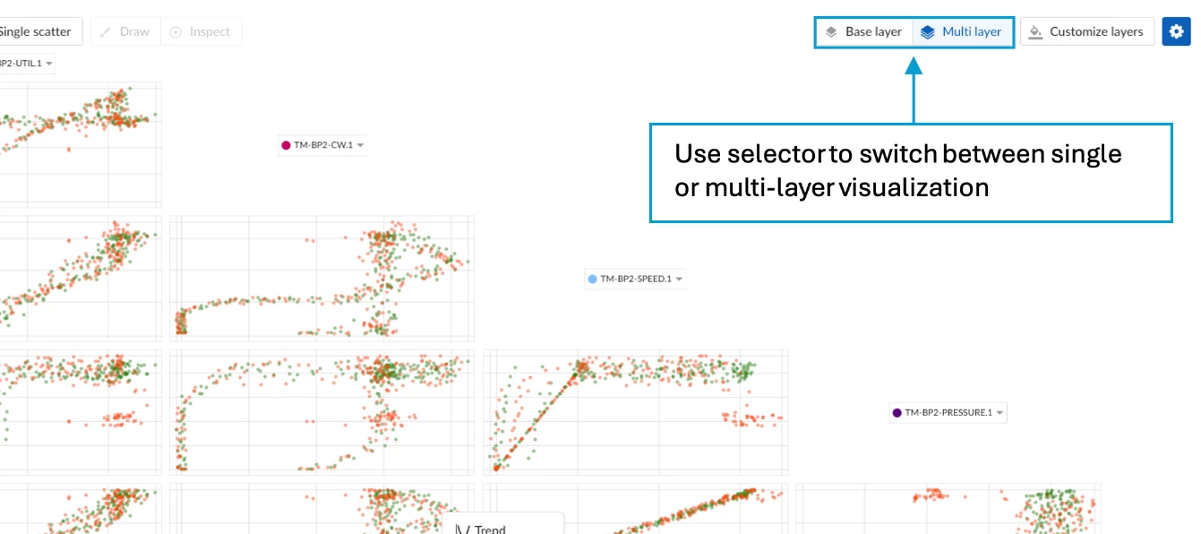
Step 2: Switching to Scatterplot View
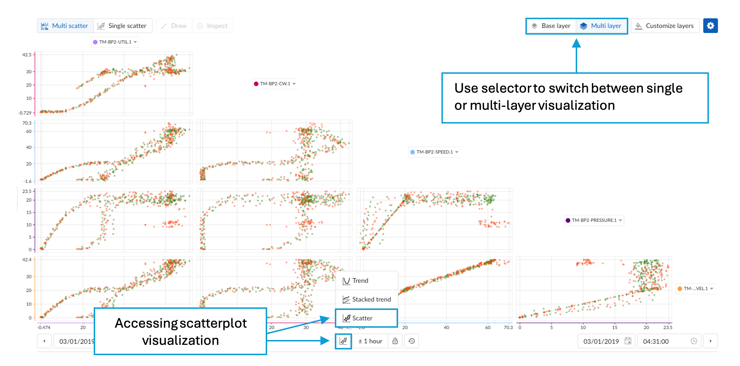
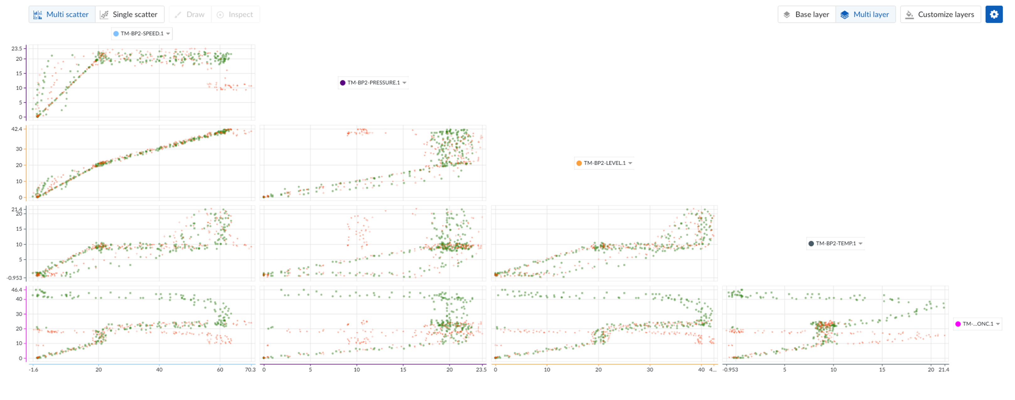
By changing the plot visualization to a scatterplot, you’ll immediately see the option to create a multi-layer scatterplot.
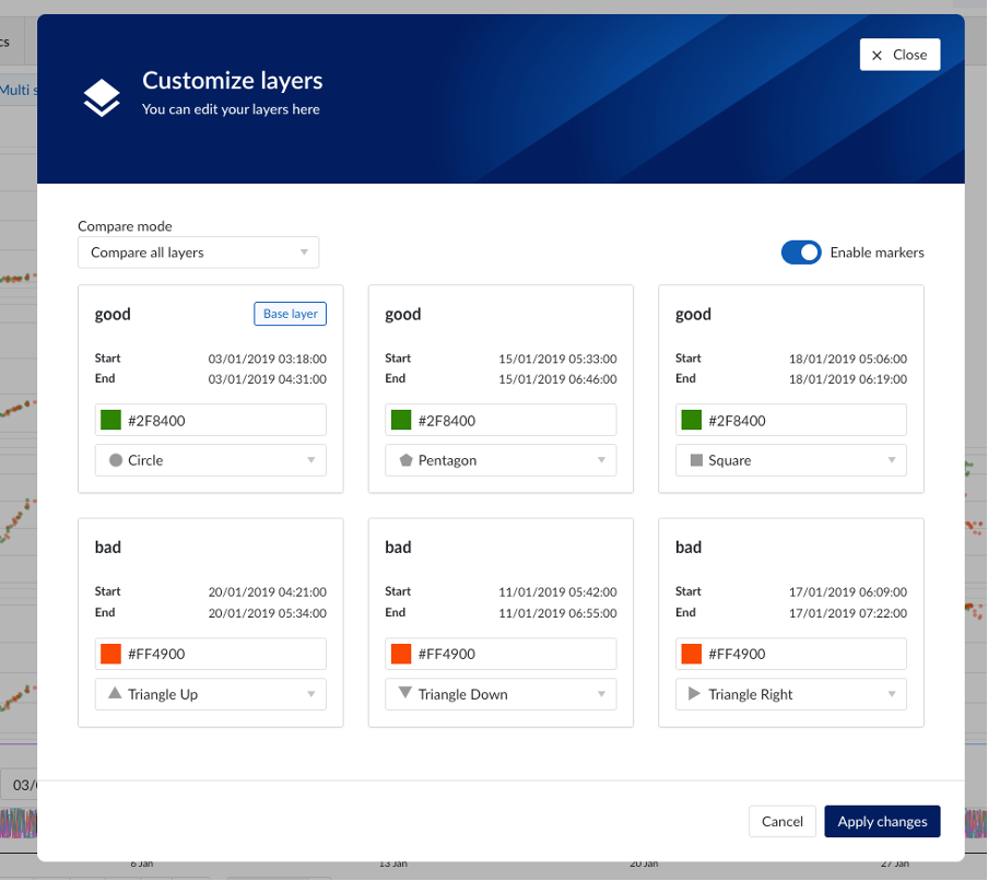
Step 3: Customizing Your Layers
Clicking the “Customize Layers” button opens a popup where you can define the appearance of each layer. You can select a unique color or shape for each layer, and you also have the option to choose a comparison mode—either compare all layers individually or compare the base layer with the others. In our example, we set the good layers to green and the bad layers to red/orange. We also assigned different shapes to each layer for easy distinction.
Step 4: Interpreting Your Results
In our batch example, where we aimed to compare low- and high-quality batches, the results are now clearly visualized. We can see distinct relationships for our low-quality batches compared to our high-quality batches, providing insights into performance differences across these categories.
Conclusion
The enhanced Multi-Layer Scatterplot feature in TrendHub opens up new possibilities for in-depth analysis and better decision-making. By allowing you to visualize and compare multiple layers simultaneously, it gives you a clearer understanding of the dynamics between different data sets. Whether you’re troubleshooting a specific issue, conducting root cause analysis, or assessing performance, this tool provides the insights you need to drive better outcomes. We encourage you to explore this new feature and see how it can enhance your workflow.
Happy analyzing!