

Creating clear and effective graphs is a vital skill for anyone involved in data presentation. In process engineering, the ability to visually convey complex information can significantly enhance the impact of your work. However, not all graphs are created equal. Poorly designed graphs can mislead, confuse, and obscure the very data they aim to highlight. This functional tip outlines essential best practices for making enhanced TrendHub views that are both informative and visually engaging. By following these guidelines, you can ensure your graphs not only accurately represent your data but also resonate with your audience, facilitating better understanding and decision-making.
- Keep It Simple:
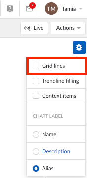
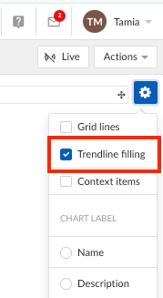
- Avoid clutter by minimizing gridlines unless they are necessary.
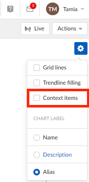
- Try to avoid displaying excessive context items unless they are needed to emphasize a reoccurring issue.
- Avoid clutter by minimizing gridlines unless they are necessary.
- Consider whether all data actually needs to be displayed in the focus chart, or if keeping longer-range data in the context bar is sufficient.
- Use Appropriate Scales:
- Ensure that axes are scaled appropriately to avoid misinterpretation.
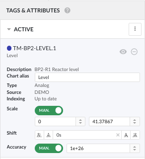
- Keep scale in mind when grouping tags.
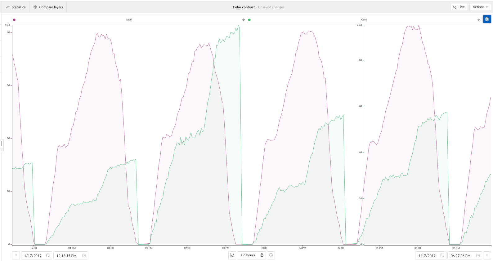
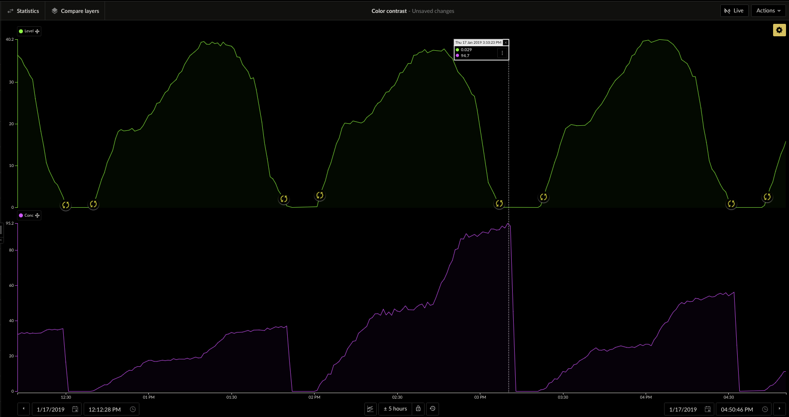
- Use Trend View instead of Stacked Trend view to display multiple axes.
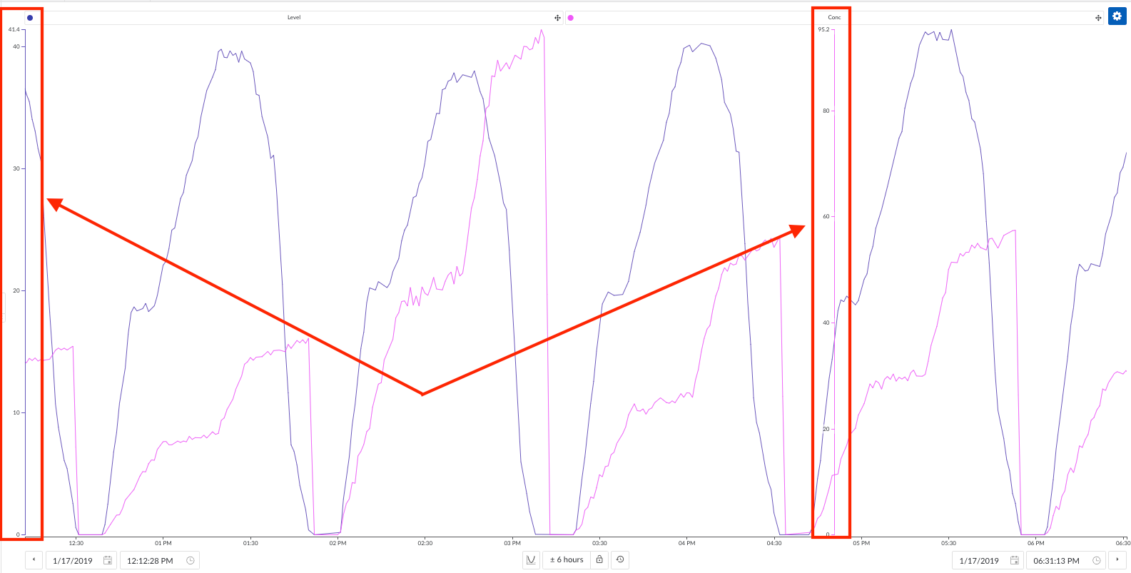
- Manually adjust axes and significant figures as needed.
- Ensure that axes are scaled appropriately to avoid misinterpretation.
- Use Colors and Styles Effectively:
- Add trendline filling to make trends more visible and minimize white space.
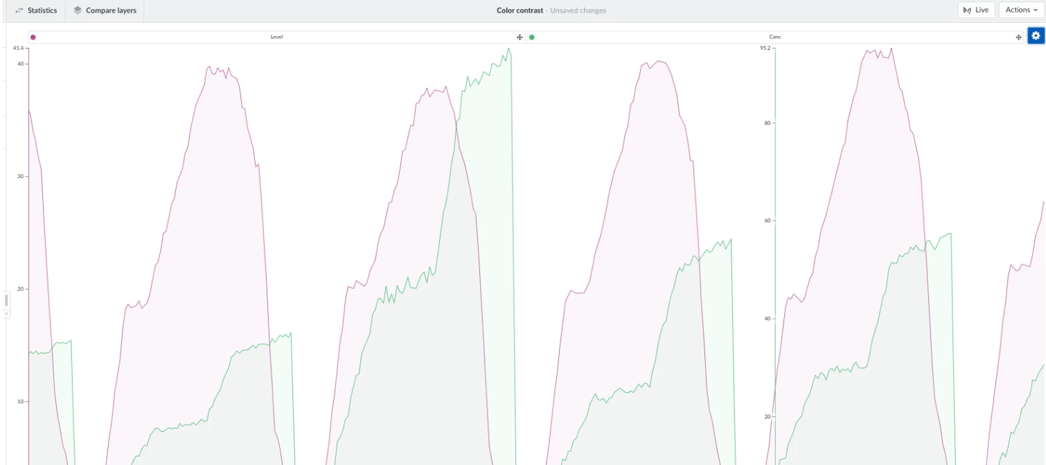
- Ensure that colors and styles are accessible to those with color blindness.
- Use the color wheel to your advantage. Try to use contrasting colors by leveraging websites like coloors to find an ideal combination.
- Minimize eye fatigue by adding a dark mode plug-in when using TrendMiner with browsers such as Google Chrome.
- Add trendline filling to make trends more visible and minimize white space.
- Highlight Key Information:
- Use annotations to highlight important data points or trends by adding data scooters and/or context items.
In general, it is best to build views that are digestible for anyone on your team. You never know when you could end up sharing a view, or presenting a finding to a business team. Feel free to drop any other TrendHub view best practices you’ve discovered below!