
One of my favorite uses for the multi-layer scatter plots is to check performance before and after asset maintenance. Not only is it interesting to compare how much the situation improved by maintenance, you can also see at a glance whether your maintenance is always equally successful, and whether you are performing it at a consistent level of degraded performance.
This scatter plot shows the correlation between product throughput (x-axis) and specific energy consumption (y-axis) for 1 day periods just before and after 3 maintenance events. I picked the same color for the layer just before and after each maintenance event, so I can see what layers belong together.
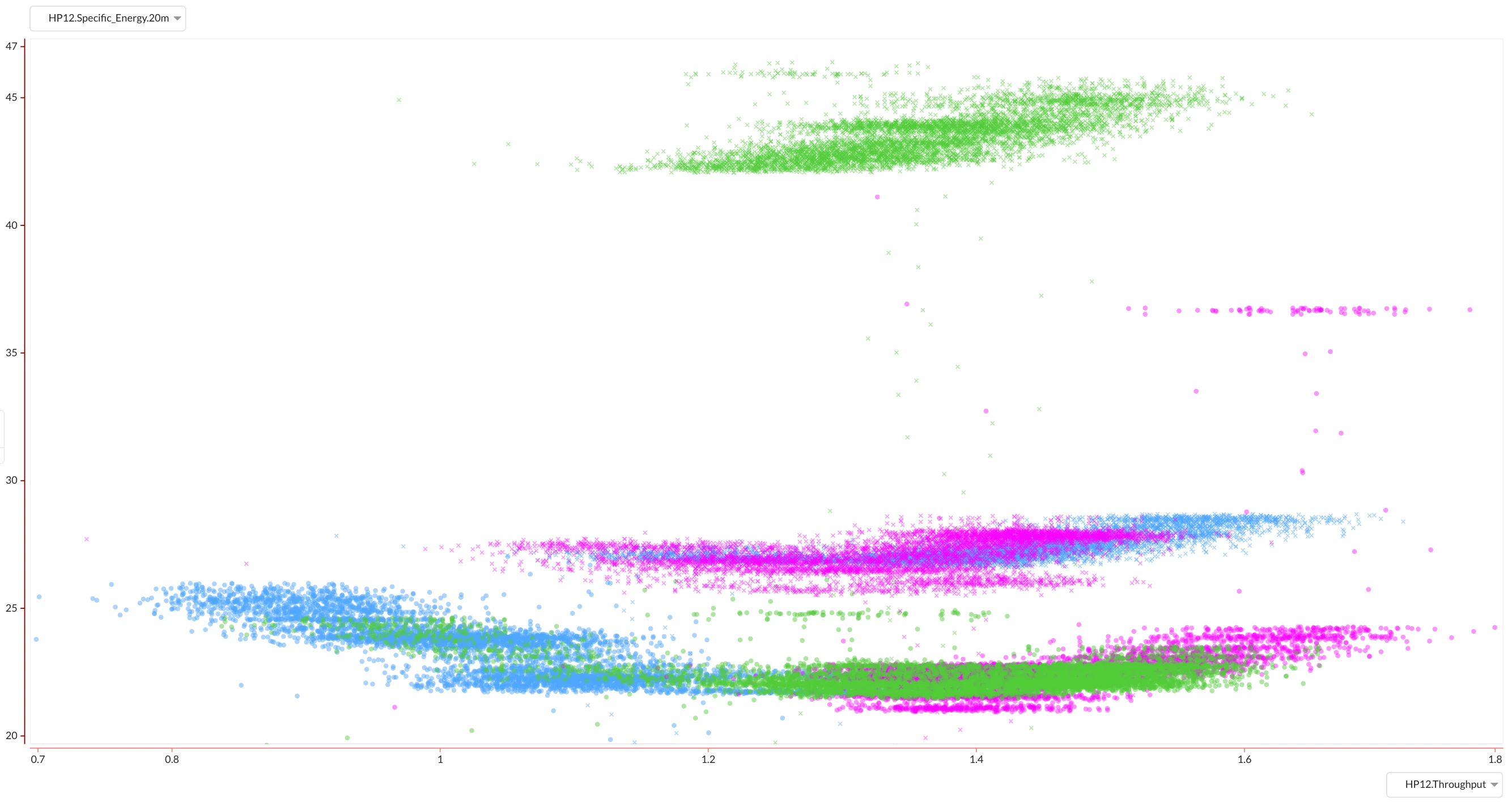
What we can indeed see from this plot is that the specific energy consumption decreases after maintenance, always returning to approximately the same level. This indicates maintenance was done successfully each time. We should also notice though that we clearly do not perform maintenance at the same level of performance degradation each time: specific energy consumption was out of control before the 'green' maintenance event. A result like this should probably trigger us to think about condition-based maintenance.
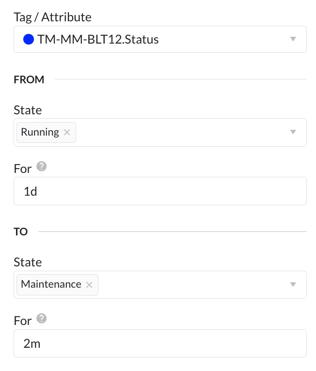
For retrieving the relevant layers, I find it easiest to use the digital step search if a digital state tag is available. We can then simply search for the state going from 'Running' for 1d to 'Maintenance' for 2m to get periods before maintenance, and from 'Maintenance' for 2m to 'Running' for 1d to get the periods after maintenance. These searches will directly return the relevant 1 day periods I need for my comparison. The 2 minutes of Maintenance data that will be included in the search results are negligible for this use case.