
Background
This use case shows how to create a custom visualization / chart that can be displayed on your DashHub dashboard as a tile. We can do this via MLHub. In this use case example, we will create a bar chart to track a key process metric at a facility, monthly average energy usage. Once we have added this visualization as a tile to the target dashboard, we can add other visualizations, as needed, following a similar procedure. These dashboards can then be shared with your peers.
Solution
The solution includes the following steps:
- Create a TrendHub view: Create a TrendHub view with all of the relevant tags. Adjust the time period on your focus chart. You will want to include all of the data that will be used to create your visualization. Save this TrendHub view.
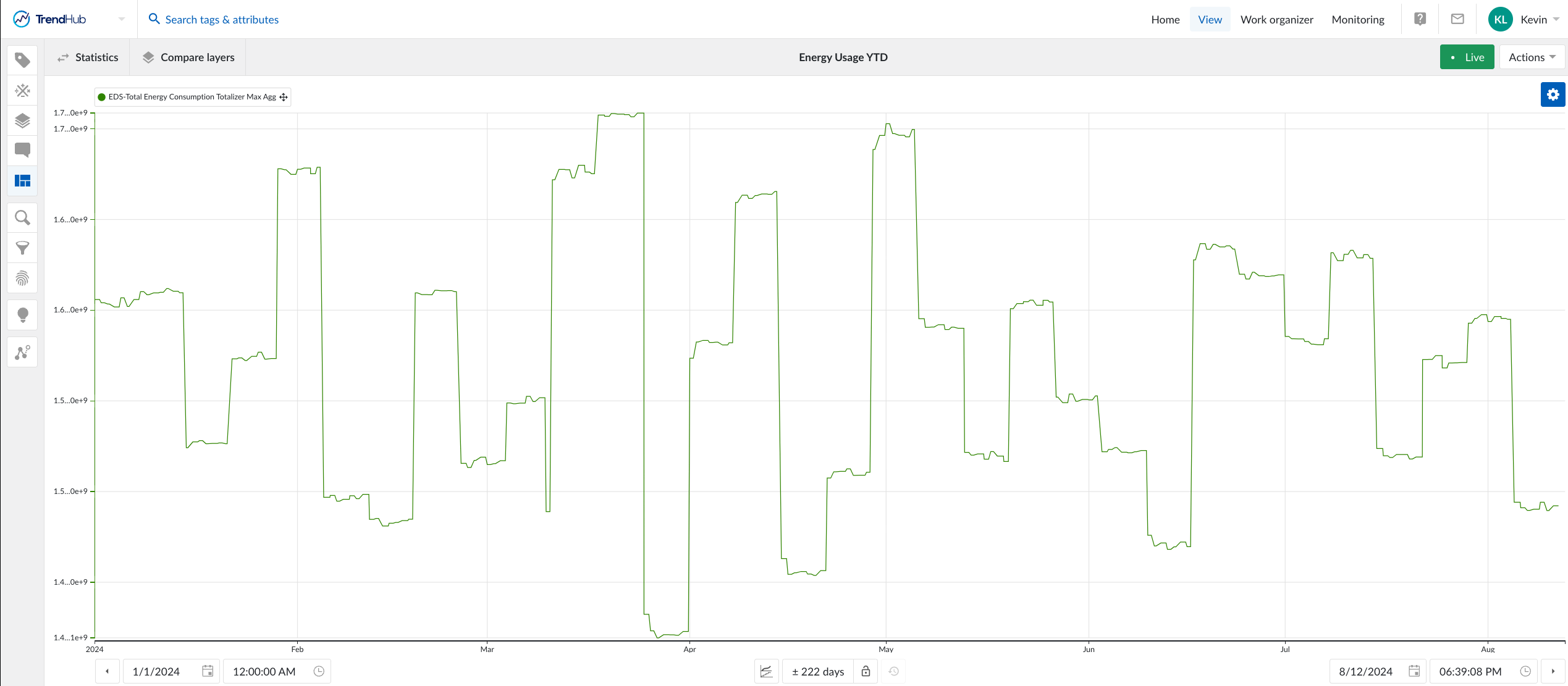
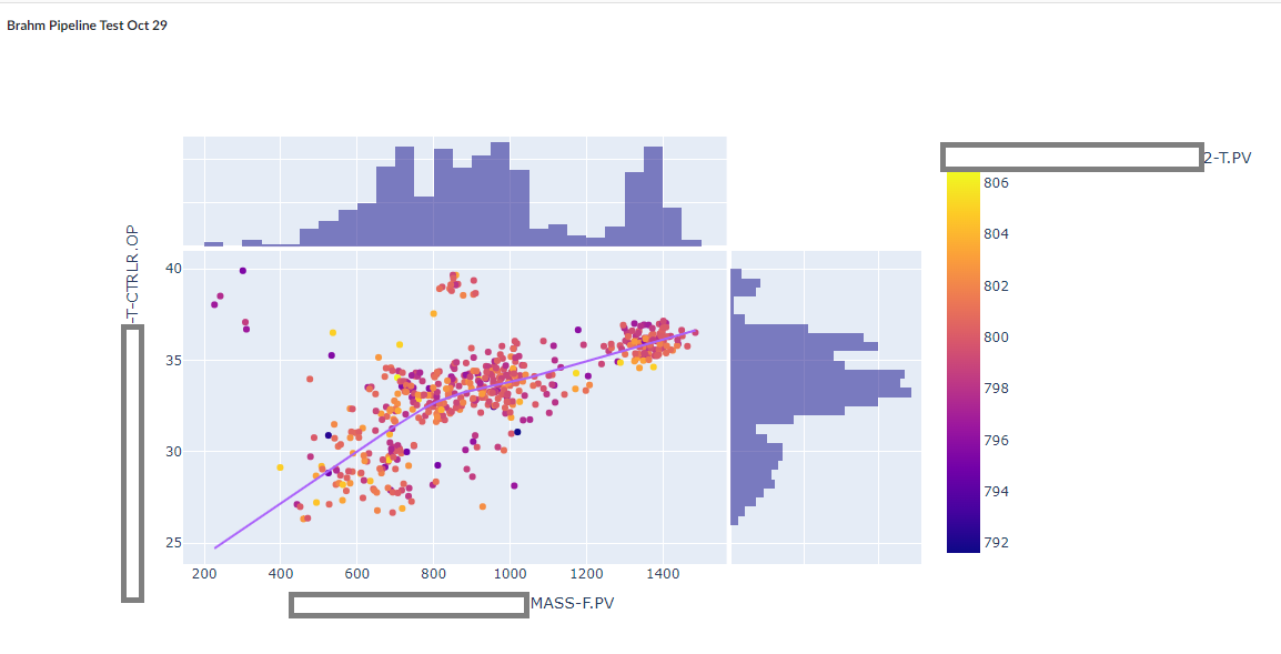
TrendHub view with focus chart duration spanning the entire year of 2024. - Create a new MLHub notebook: Navigate to MLHub and create a new notebook.
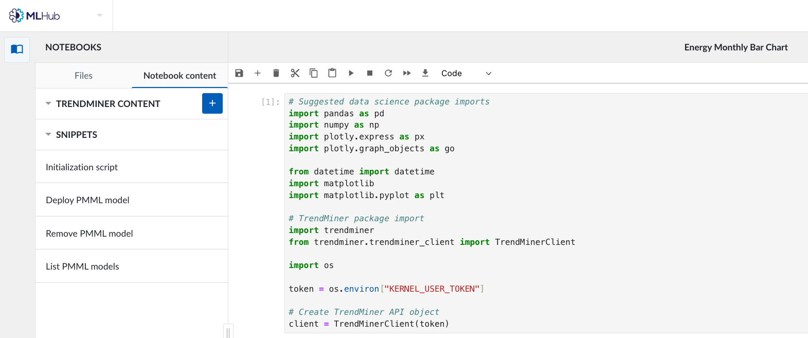
- Insert initialization script: On the left-hand side of the notebook, select the Initialization script located under “Snippets”. This will load the initialization code cell into the notebook.
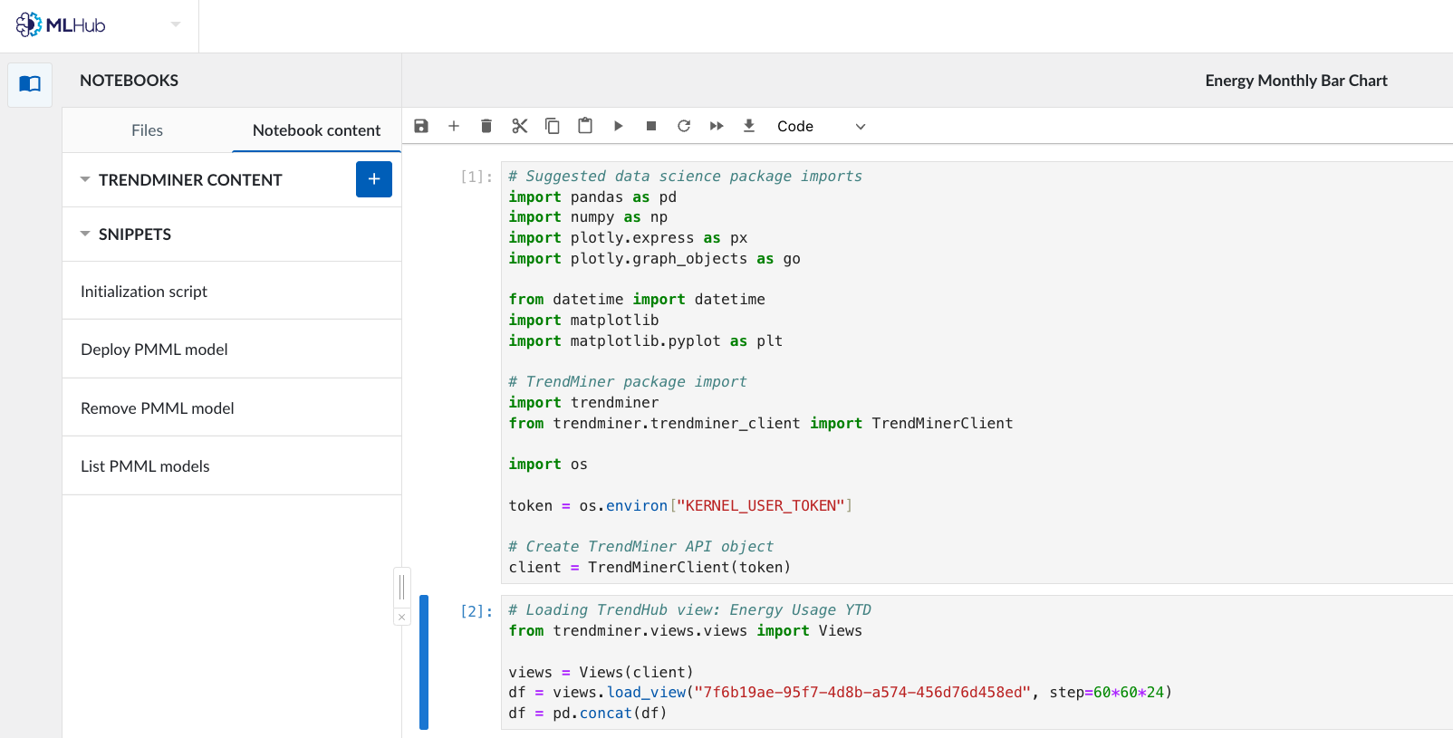
Initialization script snippet added to the notebook (I included plotly import statements because we will be needing that library to create our visualization). - Load your saved TrendHub view: We will now bring in the TrendHub data into the notebook. To do this, select the blue plus button next to “TrendMiner Content”. The system will then prompt you to select the TrendHub view. Once the view is selected, the code to load the data and the view will be added to your notebook.
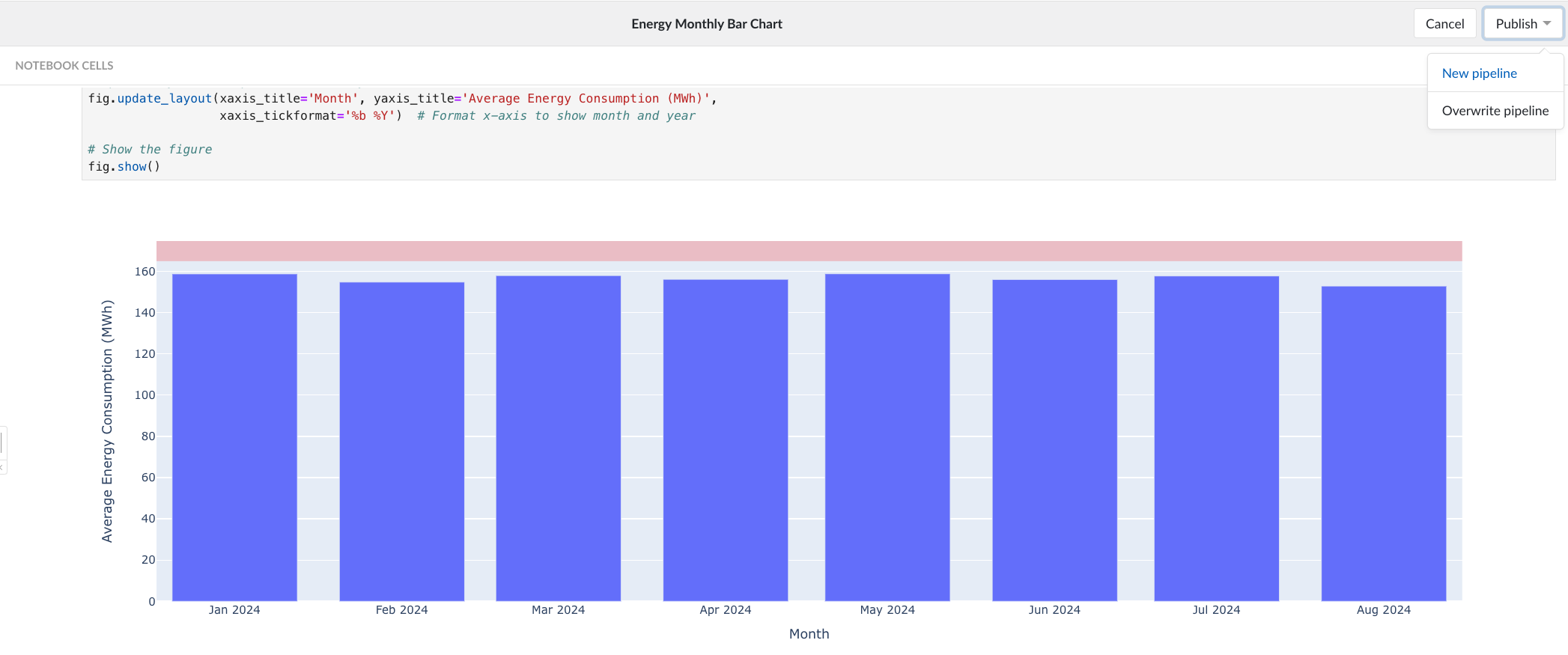
- Code the visualization using the data from the view: Now that we have our TrendHub data stored as a dataframe, we can create our visualization. I will be using Plotly to create a bar chart, which will display monthly average energy usage. In my code, I have a few data preprocessing steps - resampling the data to a monthly frequency since we want to show monthly statistics and converting the units - and formatting the chart - adjusting and labeling the y and x axes.
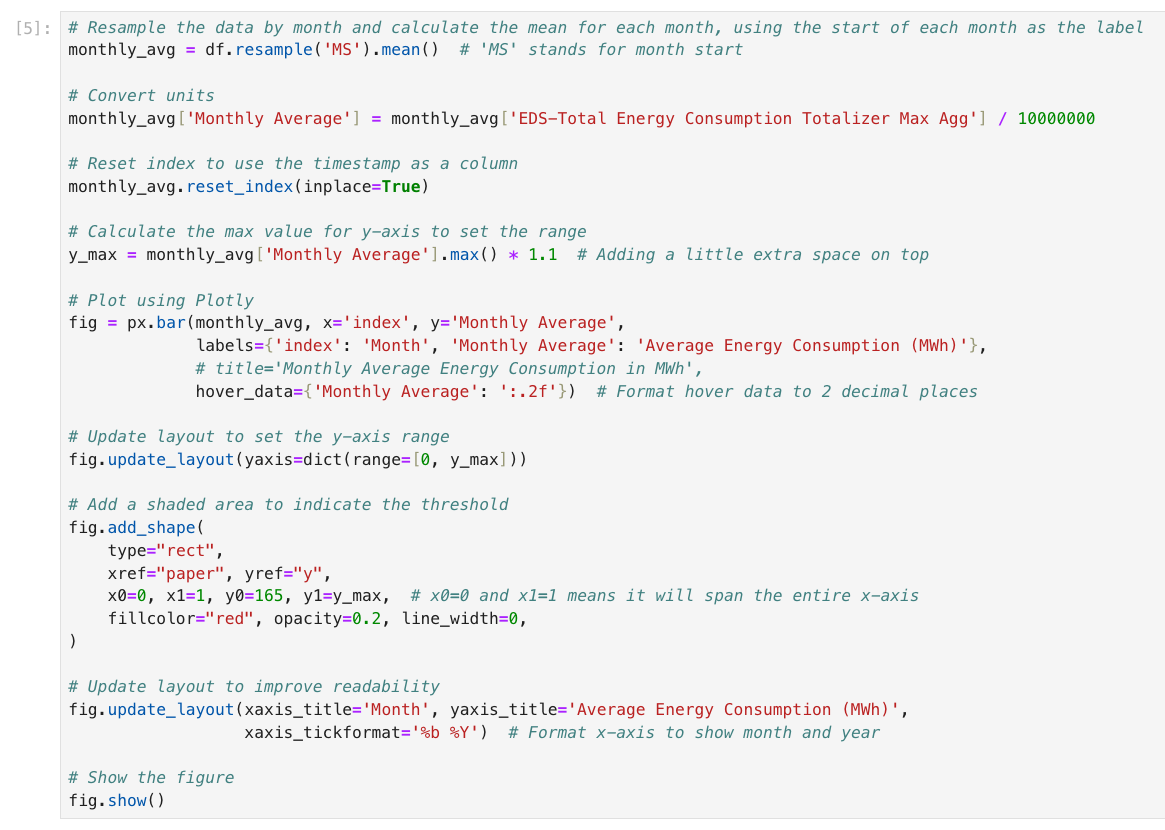
Code to create Plotly bar chart. 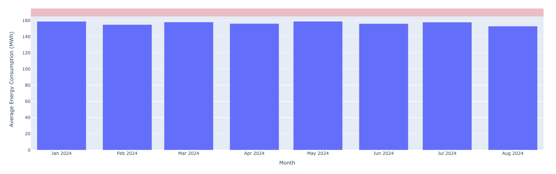
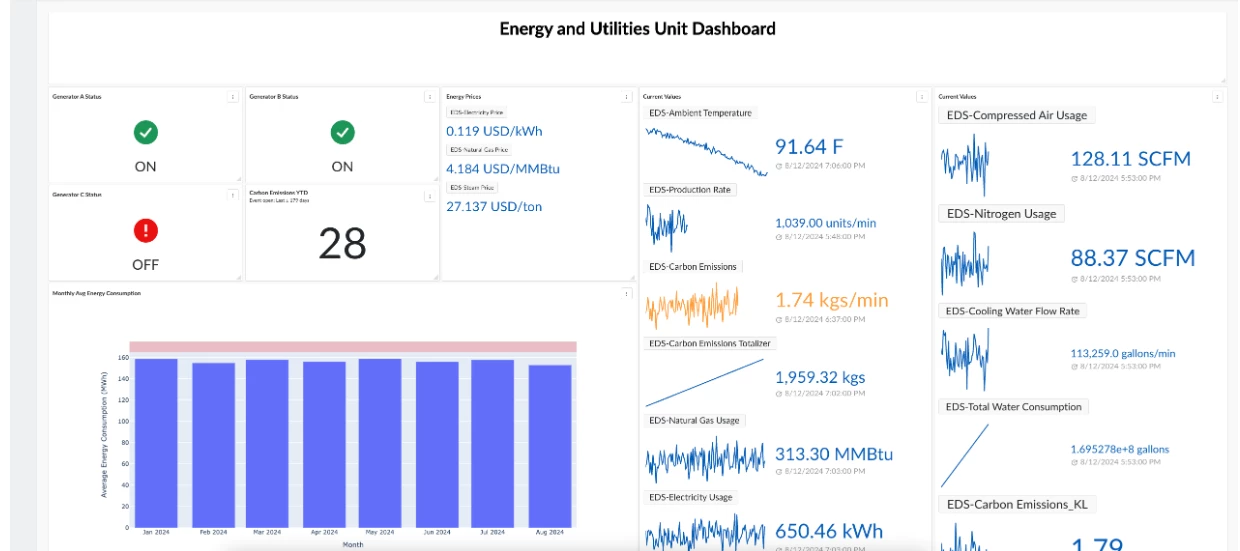
Plotly bar chart created from the code above. - Dashboard Integration: In order to display this bar chart in our target dashboard, we first need to publish a pipeline. At the top right of the screen, select “Publish → New Pipeline”.
To display this chart in a dashboard, we first need to publish a pipeline. Select all of the code cells that we used to create the figure. In this example, this includes the initialization snippet, the TrendHub view loading snippet, and the figure creation code block. Once the pipeline has been created and saved, we can navigate to our dashboard in DashHub. In your target dashboard, create a new tile (make sure you are in Edit mode). Select “Notebook output” and then choose the Pipeline we just created. After clicking “Add new tile”, the figure should now be displayed as a tile - kudos!
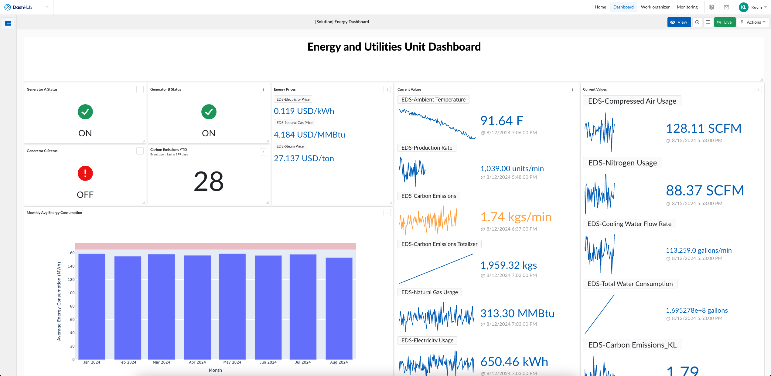
Custom visualization added to target dashboard.