

📌 Background
Every production site collects and stores massive amounts of process data — far more than is typically analyzed. For engineers, gaining a holistic view of plant operations can be a daunting task.
TrendMiner’s layer comparison and compare table features make it easy to visualize and quantify how different operating periods performed, side by side.
By leveraging this functionality, users can quickly identify high-performing periods and understand which process conditions led to those results.
📌 Objective
Use historical data to identify ideal operating conditions by comparing performance over several time periods (for example, across months).
With just a few clicks, TrendMiner users can:
-
Compare key process variables over multiple months,
-
Identify which periods performed best, and
-
Spot potential process differences that may have led to underperformance.
🛠️ Solution
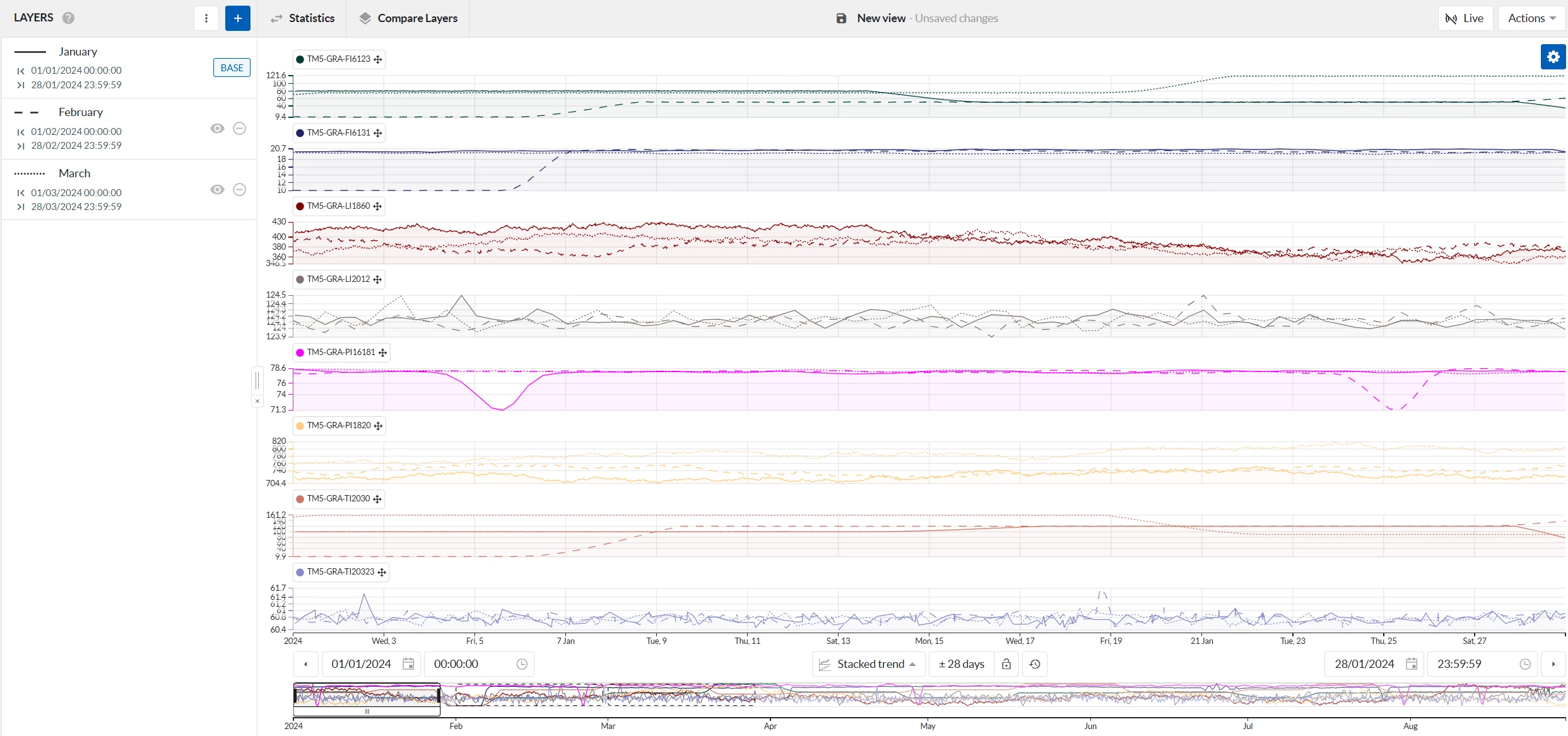
1. Create a Layer for Each Period
Start by selecting the process tags you want to compare — for example:
-
Raw material flow,
-
Reactor temperature or pressure,
-
Product flow rate, or any other key variable.
Then select a base period (for instance, January) and add additional layers for other periods (February, March, etc.) using the layer menu.
All selected layers will appear overlaid in the focus chart, allowing you to visually spot major differences between periods.
You can highlight any individual layer from the Layer Menu to make comparisons even clearer.
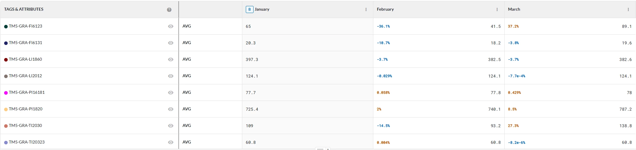
2. Compare the Layers Quantitatively
Next, open the compare layers table to quantify the differences between the layers.
This table automatically calculates average values and other key statistics for each tag across all selected layers, and shows how each period compares to the base layer.
Example outcome:
-
The monomer flow (TM5-GRA-FI6123) was highest in March, lowest in February.
-
The product flow (TM5-GRA-FI6131) was highest in January, lowest in February.
These differences reveal which periods performed better and help identify which process variables may have contributed to those results.
Optionally, you can:
-
Apply filters to exclude downtime or non-production periods.
-
Explore additional statistical measures available in TrendMiner, such as standard deviation or range, to further assess process stability.
✅ Value
-
Quickly identify top-performing periods — Spot which months delivered the best results at a glance.
-
Understand what drives performance — Determine which process variables change between high and low performance periods.
-
Define ideal operating conditions — Use the best-performing months to benchmark target values for key process parameters.
-
Save time — Perform all comparisons directly in TrendMiner, without external tools or manual data exports.
-
Enable data-driven improvement — Back up operational decisions with clear, quantitative insights.
Try it yourself!
Use the layer comparison and compare layers table features in TrendMiner to explore your own historical data.
Which conditions define your best-performing months? Share your insights and findings with the TrendMiner Community!
