
Background
In any industry, It is not uncommon for plant managers to have questions about the status and efficiency of manufacturing units. There can be several hundred or even thousand tags for a single process depending on its complexity. Creating a dashboard allows users to centralize the trends for those tags in a digestible format.
Challenge
Oftentimes, production questions from management can be time-consuming and even intimidating to address. When a plant manager inquired about the status of a unit in the morning, a dashboard was created to ease their concerns within hours.
Solution
- Identify relevant tags
- Consider what KPIs and parameters are important to management. Some examples are:
- flow rates for high-cost reactants
- extrusion rates (if applicable)
- expensive or shared utilities
- quality data
- production rates
- safety valve positions
- flaring
- Consider what KPIs and parameters are important to management. Some examples are:
All of these have financial, environmental, or safety implications.
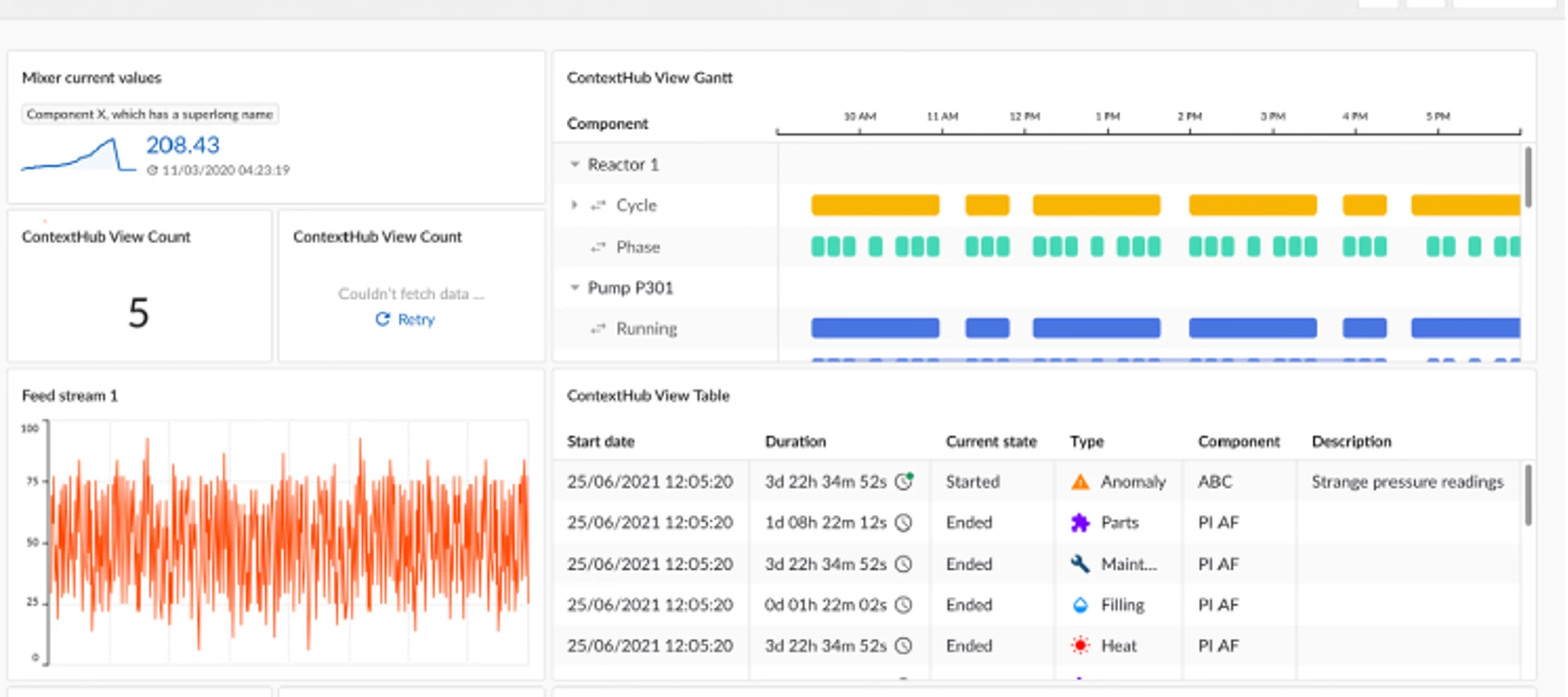
- Create views and monitors
- Create TrendHub views and group relevant tags together. Do not forget to apply filters to remove time periods when there were planned downtimes or less relevant periods
- ContextHub items and their corresponding views can be made to tabulate lab data or other context data. Leverage conditional formatting to illustrate good and bad results
- Monitors should be created for any conditions that you would like to display with monitoring tiles on the final dashboard
Color contrast, axis formatting, and clear view titles are important as the dashboard will serve as a living presentation to management.
- Assemble the dashboard
- Add the tiles for each view that you created in the previous step
- Explore how different views can be presented with each tile type:
- It may be more impactful to display a ContextHub view in a Gantt Chart if time is important
- Current Value tiles could be useful to display the exact values of important tags that appear in TrendHub view
- Text tiles can be used to create headings for different sections or narrate why certain views are particularly insightful
- A PFD or block flow diagram that provides a high-level unit overview can be incorporated using an External Content tile
- Share the dashboard
- Sending it to a colleague or mentor for feedback before sharing it with management could be helpful to ensure important information has been captured
- Update and modify it as needed
Value
By creating a Unit Overview Dashboard, management is consistently and directly informed on the unit's health and status. If the end user creates a similar dashboard for themselves, or even reviews this one as a part of their day-to-day workflow the compilation of various views may also forewarn engineers of imminent unit issues.