

Background
As a process engineer, understanding the relationship between two variables is crucial and often necessary. For example, how does tower pressure impact overhead rates? How does temperature affect conversion? Operations are constantly making adjustments, and process engineers need to grasp the impact of various levers or handles on final product specifications, operating envelopes, and process safety. TrendMiner enables users to quickly analyze relationships between tags or variables, both visually and quantitatively.
Steps to Analyze Relationships in TrendMiner:
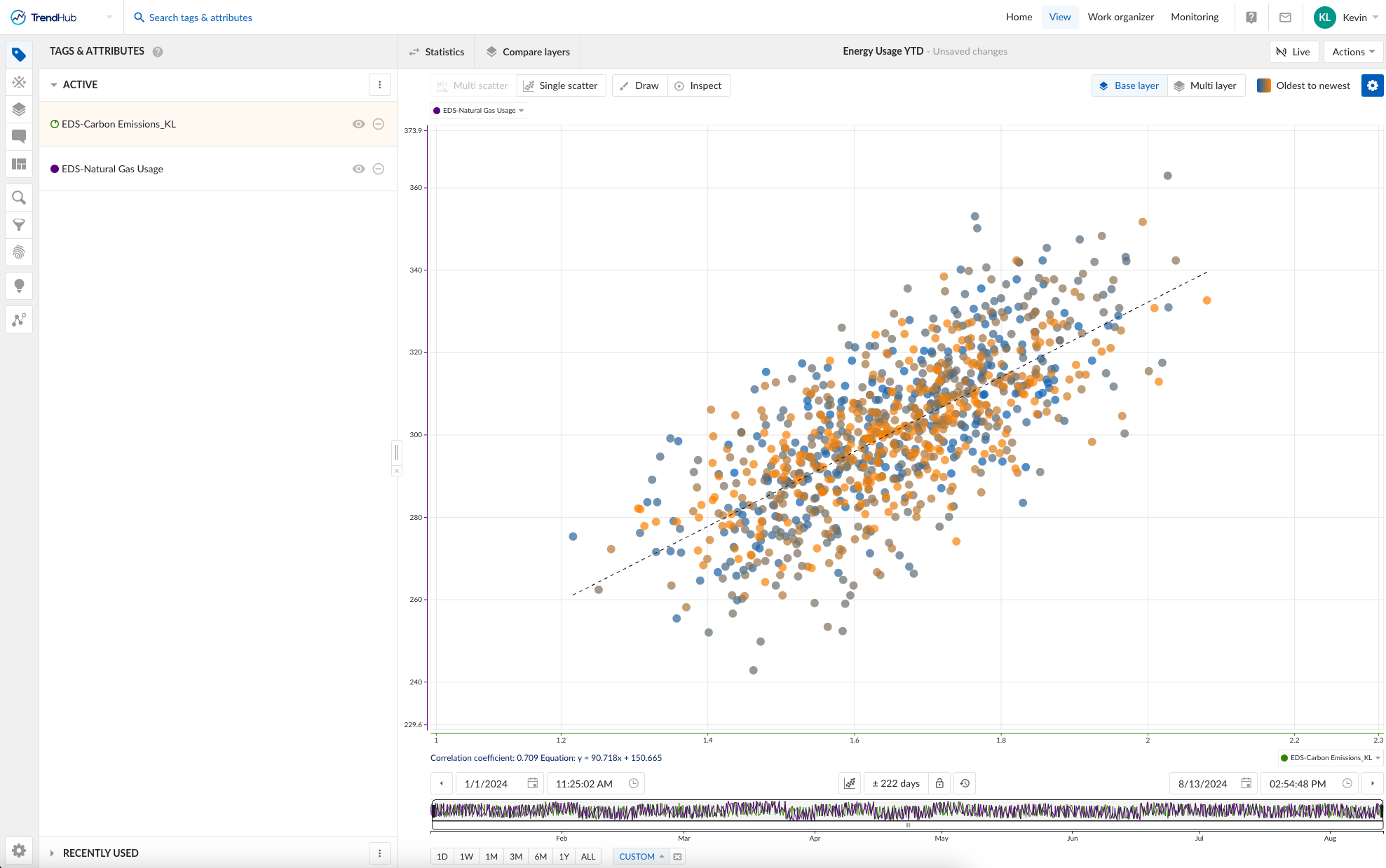
Step 1: Add the tags you are interested in analyzing to the active tag list for bivariate relationships.
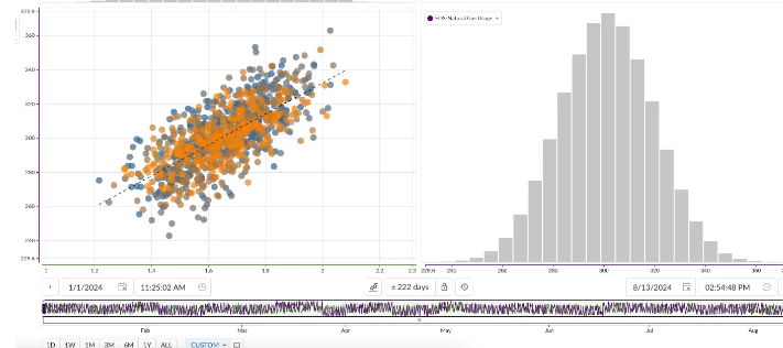
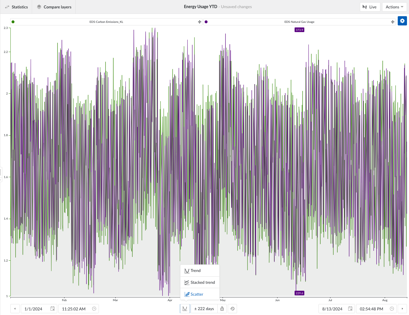
Step 2: Switch to the Scatterplot view.
Step 3: Adjust the time period to include relevant data for your analysis.
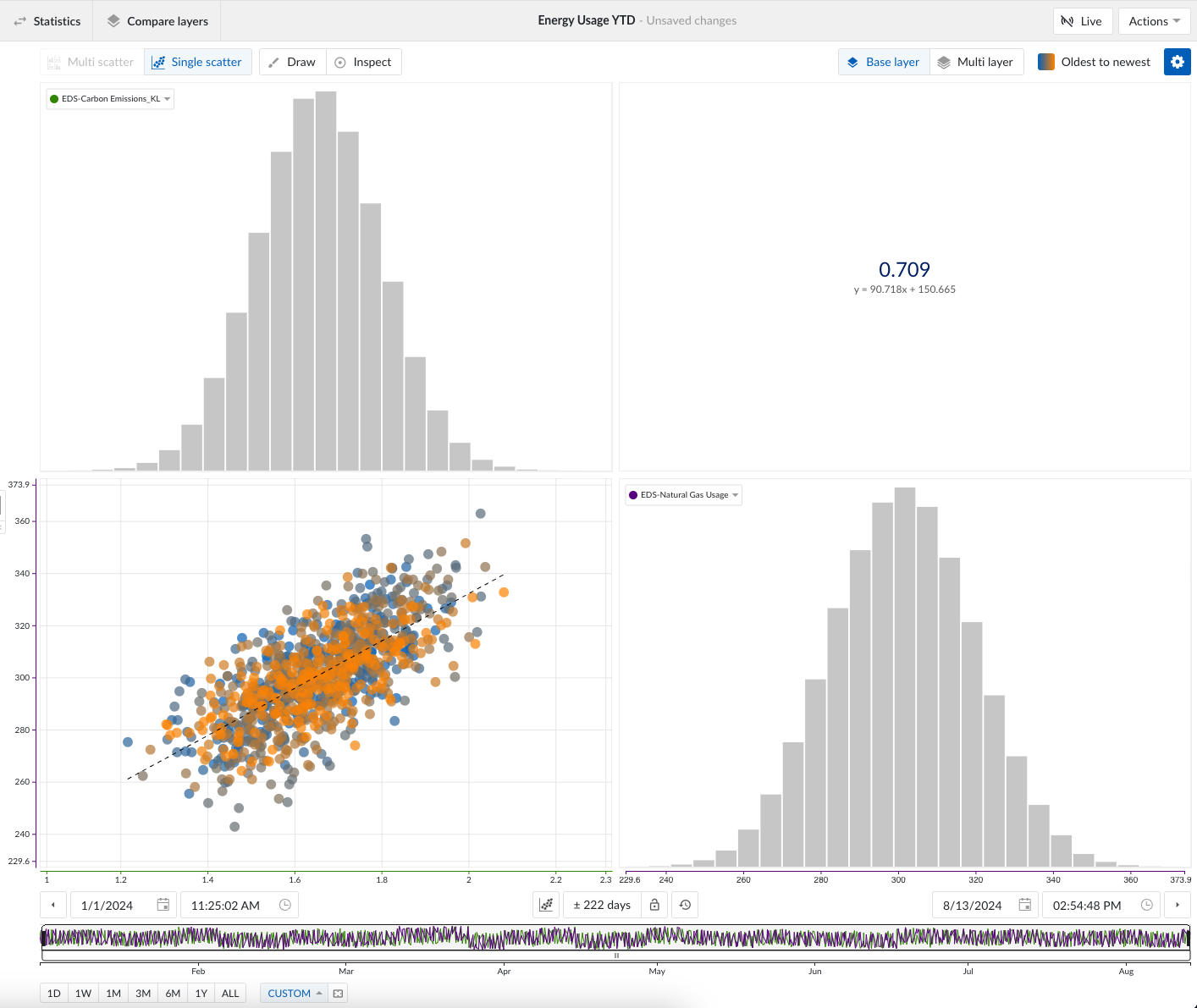
Step 4: Evaluate the relationship. Use the scatterplot to qualitatively assess the relationship between the variables. You can toggle on colored points to visualize the temporal evolution of the data. For quantitative analysis, toggle on the correlation feature to compute the Pearson correlation coefficient and the line of best fit between the two variables.
Note: To evaluate non-linear relationships, you can manipulate your tag data using the Tag Builder → Formula option before conducting the scatterplot analysis. For example, if you want to assess a logarithmic relationship, apply a log transformation to your tag using the Formula Tag Builder. You can then use the newly created formula tag in your scatterplot.
Conclusion
Quickly evaluate relationships in your process data by leveraging TrendMiner’s scatterplot view. Scatterplots allow for qualitative analysis, while the correlation coefficient and line of best fit provide quantitative insights. Time can also be visualized through the colored points toggle. Let us know what kinds of relationships you discover using this feature!